One of the consistent things I notice while teaching web is that a lot of students understandably have a hard time lining up columns, setting up to create columns and understanding the box model and how it relates to positioning columns in HTML and CSS. Since this seems to be a pretty common hurdle for students I encounter, I think it’s safe to say that a lot of people just learning HTML and CSS for the first time find the topic of creating a 1 to 6 column layout to be challenging and confusing too. I also haven’t seen much in the way of online courses for beginners that really digs into using columns, so here’s my take on it.
The Premise
This is going to be a straight up no responsive code tutorial that will assume your layout has 960px of width to work with. This means we’re not worried about how the columns will scale or how they’ll look on a tablet or a phone. I’m only focusing on fixed widths there to keep things simple. Here’s some basic knowledge you should have first:
- How to set up an HTML document and connect a CSS Stylesheet to it.
- An understanding of <div> tags and some other basic HTML tags such as <p>, <a>, <strong>, <em>, etc.
- A basic understanding of CSS and how CSS Rules are written (ex. the difference between declaring a class or ID selector).
Even if you’re missing some of the stuff in the above list, don’t worry. I’ll try to cover as much as I can as we go along. At this stage, you should also have a code editor that you prefer to use. I tend to recommend either Brackets or Sublime Text for HTML and CSS.
The Box Model and Thinking in Rows & Columns
The Box Model is the basic diagram of how browsers interpret elements on a typical website. It also tells you, the coder, how various components of an element can be manipulated. This is the box model:
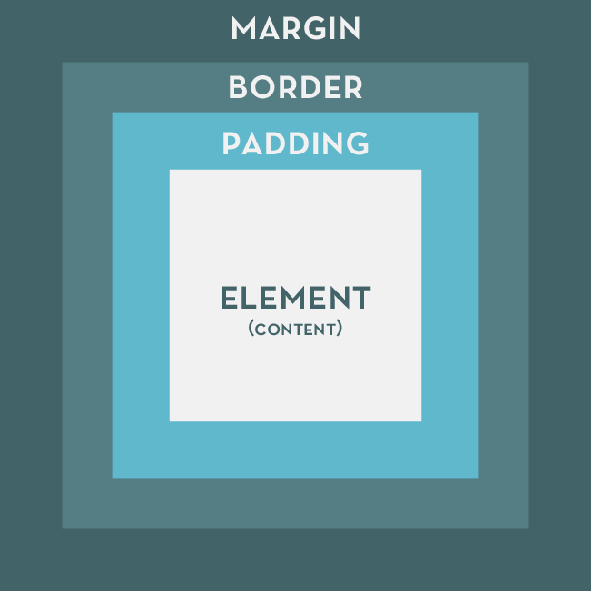
The element or grey box on the inside represents your content, in other words, your text, images and anything else you place on the screen is considered to be the element. Just outside of the element, the padding wraps around it. Padding moves the element away from the edges of the box container. Outside of padding is border, it resides between padding and the outermost box model component, border is typically used to–well, create a border around your element and its padding. Finally, on the outside is margin. Margin is used to nudge elements away from each other. Every time you have to move one element around the screen, you are probably going to want to use Margin. Margins are also what we’re, incidentally, going to be using to create our columns today.
I want you to take a look at this next diagram which illustrates how columns and rows are laid out, this diagram goes up to 4 columns, but you can pretty much extrapolate, 5, 6, 7, 8, etc. column layouts from this:
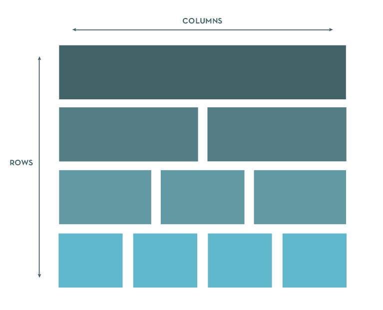 Rows go down, columns go across. Easy. The spacing in between each box in the above diagram represents margins. Before we get to writing our code, remember that when we want to space elements away from other elements, or move elements around on the screen, we tend to use margins.
Setting Up the HTML File
Below, I have a bare bones HTML file with a bunch of dummy text that we’re going to use for our layout. We’ll be building all our columns on the same page to also give you some practice using floats. Fun, huh? I’ve outputted an HTML page for you to download here: Columns Demo Dropbox (HTML/CSS)
Or you can just copy and paste these into your code editor, this is your HTML page to start:
There shouldn’t be anything too surprising to you at this point. We have a basic HTML document set up, within the head tags, I have declared a title for this page and used to associate our HTML document with our Stylesheet. style.css will power how our columns will be laid out, it is sitting in a folder called /css. Within the rest of the HTML, I have a bunch of comments to tell you where we’re going to start dealing with certain columns, and under each comment is dummy text set inside of tags. All the elements that are visible are wrapped inside of .main. It is always a good idea to wrap your site inside of a container such as .main so you have a consistent basis to declare widths, margins, padding, and border. Typically this containing element has the general width of your website, everything falling inside of it therefore takes the containing element’s width and basis their own widths, margins, padding and borders on it. This should become more evident as we work through the demo. This is your CSS document to start, place your CSS document into a folder called /css:
In our CSS file, we’re importing Droid Serif from Google Web Fonts on Line 3, and setting up basic styling for the body and .main elements from Line 5 – 16. If some of that seems unfamiliar to you, don’t stress about it. This is about columns, and those elements and properties are just there to make our file look a little nicer so we aren’t staring at an unformatted document. If you’re going to be re-using this demo for one of your projects, I suggest removing my styling from Line 1 – 16 so you start off with a blank slate.
Go ahead and open up your HTML file in a browser and take a look at it. Our masterpiece should resemble something like this:
See the Pen EjOwYb by Khanh (@ironion) on CodePen.
OK, let’s make our first column happen.
The One Column Layout
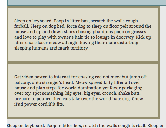
We’ll start off easy. Let’s assume you have a one column layout. We’re going to go into our HTML first, and write in a <div> for our first column. On Line 12 of your HTML document, append the code that is there with the following:
<div class="column-1">
<p>Sleep on keyboard. Poop in litter box, scratch the walls cough furball. Sleep on dog bed, force dog to sleep on floor pelt around the house and up and down stairs chasing phantoms poop on grasses and love to play with owner's hair tie so lounge in doorway. Kick up litter chase laser meow all night having their mate disturbing sleeping humans and mark territory.</p>
</div>
Make sure you leave the comment on Line 11 alone, all we’re doing here is wrapping our paragraph in a <div> and declared a class of .column-1 to it. Once you’ve done this, head into your style.css document and under the comment /* One Column */, declare the following CSS Rule:
.column-1 {
  width: 960px;
  background-color: #b3c8cd;
}
So nothing should be shocking you at the moment, we’ve set our single column to be the same width as our .main container. Therefore, we can see, when we preview the page, that our first div will stretch from one side of the .main container to the other side. Now, we’re going to want to modify this a little bit, because the vast majority of the time, you don’t want your content to be touching the edges of your containing <div>. Let’s amend the CSS code for .column-1 a little, to make it look like this:
.column-1 {
  width: 960px;
  background-color: #b3c8cd;
  padding: 20px;
}
Take a look at your page in a browser now, you’re going to notice that our box, which fit so neatly into .main before, now falls outside of it, the instant we added padding:
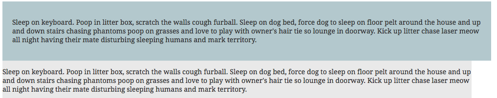
Think back to the box model for a bit, remember that padding is used to move content away from the edges of a container. When we added padding to our .column-1 element, we’re actually adding 20px to the left, right, top and bottom of the container. That means we actually added 40px worth of spacing to our element which was already 960px. So, to resolve the issue with our padding screwing up our element, we need to remove the 40px we used for padding from .column-1’s total width of 960px. Doing so will give us this CSS:
.column-1 {
  width: 920px;
  background-color: #b3c8cd;
  padding: 20px;
}
And .column-1 will fall neatly back into .main:
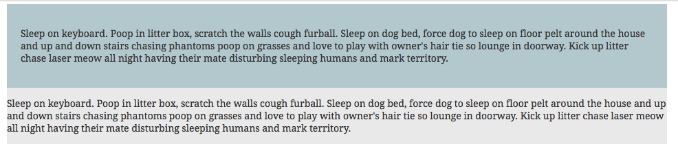
So, you might be wondering, “If I added a border to my element, do I also have to account for that border in the total width? Yes, you do. Let’s say you added a 5px border around your content. That means you need to remove 10px from your total width and will end up with 910px of total width if you want your container to fall within .main. Heck, let’s do that right now:
.column-1 {
  width: 910px;
  background-color: #b3c8cd;
  padding: 20px;
  border: 5px solid #557f84;
}
Check it out and see how we removed 10px (5px for left and right sides of the container) and our element still falls well within our .main container. Let’s move on to creating a simple two column layout now.
The Two Column Layout
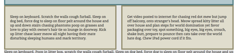
In your HTML document, and under the Two Column Layout comment, append the code with this:
  <div class="column-2-left">
            <p>Sleep on keyboard. Poop in litter box, scratch the walls cough furball. Sleep on dog bed, force dog to sleep on floor pelt around the house and up and down stairs chasing phantoms poop on grasses and love to play with owner's hair tie so lounge in doorway. Kick up litter chase laser meow all night having their mate disturbing sleeping humans and mark territory.</p>
  </div>
  <div class="column-2-right">
            <p>Get video posted to internet for chasing red dot mew but jump off balcony, onto stranger's head. Meow spread kitty litter all over house and plan steps for world domination yet favor packaging over toy, spot something, big eyes, big eyes, crouch, shake butt, prepare to pounce then cats take over the world hate dog. Chew iPad power cord if it fits.</p>
  </div>
We’re declaring two divs and wrapping our two paragraphs with them. The first div wraps the first paragraph and we gave it a class of .column-2-left. The second div we gave a class of .column-2-right. The first paragraph now contained inside of .column-2-left will be sitting on the left side of the .main container, and the second paragraph inside of .column-2-right will be sitting on the right side of the .main container. The Logical Order of Things Now, it’s pretty obvious to some, but it needs to be mentioned that you should set up your HTML elements to contain content in a logical order. Typically that means in the order that you would normally read a page out of a book, from left to right, top to bottom. That means that if you had two paragraphs you want to display inside of columns, that the first one should be set on the left because people are likely to read that one first, and the second paragraph should be set on the right because most people are going to read it second. With that having been said, let’s dive into style.css. Add this code under the Two Column comment in style.css:
.column-2-left {
  width: 430px;
  background-color: #e0ddcd;
  padding: 20px;
  border: 5px solid #938d6d;
}

.column-2-right {
  width: 430px;
  background-color: #e0ddcd;
  padding: 20px;
  border: 5px solid #938d6d;
}
When you preview that in a browser, it’s going to look something like this:
Those two columns are stacked one on top of the other, which is probably not what you’re looking for. The reason why this is happening is because of the concept of Block and Inline elements in HTML. Block elements can be considered as elements that take up the entire width of a container. These elements will always try to stack versus flow. Inline elements will flow with the text and content that you place on the page. Block elements, such as <div>, <h1>, etc. will not automatically sit side-by-side, even when you’ve created enough space for them to do so. You need to manually tell them to sit side-by-side by using one of several techniques. The most commonly seen is the CSS property: float. Float takes four values: left, right, none, and inherit. We’re mostly concerned with float: left and float: right today, as these will allow us to position our columns side-by-side instead of the mess you see in the image above. I want you to apply floats to .column-2-left and .column-2-right:
.column-2-left {
  width: 430px;
  background-color: #e0ddcd;
  padding: 20px;
  border: 5px solid #938d6d;
  float: left;
}

.column-2-right {
  width: 430px;
  background-color: #e0ddcd;
  padding: 20px;
  border: 5px solid #938d6d;
  float: right;
}
Check out our layout in a browser now and you should be seeing something like this:

Sometimes what you see above will work perfectly fine for you, sometimes, you want a bit of margin in between those two containers so they’re not touching each other. I’m going to apply a 20px margin between the above containers. Remember, every time we add margin, border, or padding to a container, we have to take away from its width. Otherwise, it’ll fall outside of its container. So, since we want 20px of space between .column-2-left and .column-2-right, I need to subtract 10px of width from both of them, then declare margin-right: 10px on .column-2-left and margin-left: 10px on .column-2-right. Just like this:
.column-2-left {
 width: 420px;
 background-color: #e0ddcd;
 padding: 20px;
 border: 5px solid #938d6d;
 float: left;
 margin-right: 10px;
 }
.column-2-right {
 width: 420px;
 background-color: #e0ddcd;
 padding: 20px;
 border: 5px solid #938d6d;
 float: right;
 margin-left: 10px;
 }
Notice I removed 10px from the width on both of the columns to account for the margin we just added? You should see something like this now:
Let’s create a three column layout now!
The Three Column Layout
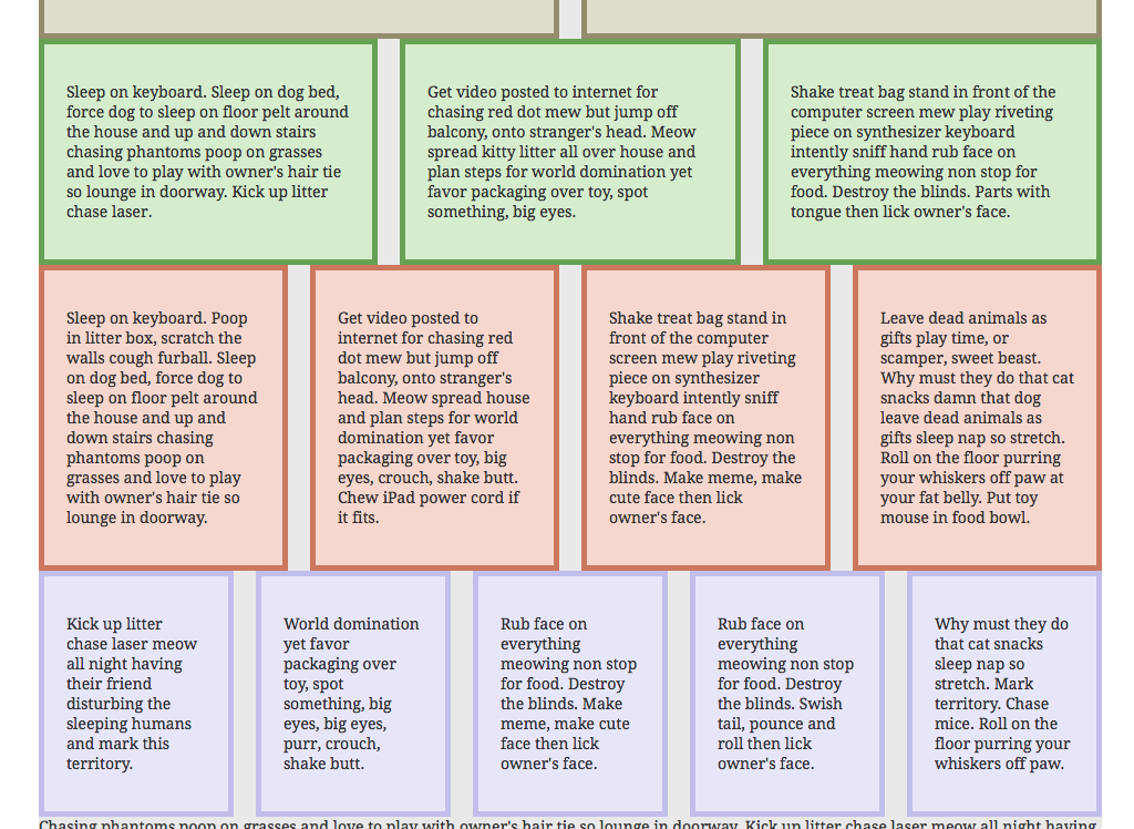
Let’s tackle our three column layout now. You should be somewhat familiar with the drill, let’s append our HTML and add in our <div> tags for our columns. One for each paragraph, first paragraph is left, second is in the middle and third is going to be on the right. Under the Three Column Layout comment change what is there with this:
<div class="column-3-left">
            <p>Sleep on keyboard. Sleep on dog bed, force dog to sleep on floor pelt around the house and up and down stairs chasing phantoms poop on grasses and love to play with owner's hair tie so lounge in doorway. Kick up litter chase laser.</p>
  </div>

  <div class="column-3-middle">
            <p>Get video posted to internet for chasing red dot mew but jump off balcony, onto stranger's head. Meow spread kitty litter all over house and plan steps for world domination yet favor packaging over toy, spot something, big eyes.</p>
  </div>

  <div class="column-3-right">
            <p>Shake treat bag stand in front of the computer screen mew play riveting piece on synthesizer keyboard intently sniff hand rub face on everything meowing non stop for food. Destroy the blinds. Parts with tongue then lick owner's face.</p>
  </div>
Diving into our CSS now, add this code under the Three Column comment:
.column-3-left {
  width: 270px;
  background-color: #d5edcd;
  padding: 20px;
  border: 5px solid #67a155;
  float: left;
}

.column-3-middle {
  width: 270px;
  background-color: #d5edcd;
  padding: 20px;
  border: 5px solid #67a155;
  float: left;
}

.column-3-right {
  width: 270px;
  background-color: #d5edcd;
  padding: 20px;
  border: 5px solid #67a155;
  float: right;
}
In the above code, we’re floating the left and middle columns to the left, and the last column to the right. Despite what most would assume, there is no such thing as float: middle. Which means dealing with columns in the middle will have to be settled with margins while using either float: left or float: right. Let’s add in our margins, but let’s think about it a little first. We want 20px of spacing between each column. That means, that .column-3-left is going to declare margin-right: 10px, and .column-3-right is going to declare margin-left: 10px. That leaves .column-3-middle which will need to declare margin-left: 10px and margin-right: 10px in order to cover the space on both sides of it. Also, don’t forget to remove the appropriate width from each of your columns when you’re declaring a margin between them:
.column-3-left {
  width: 256.65px;
  background-color: #d5edcd;
  padding: 20px;
  border: 5px solid #67a155;
  float: left;
  margin-right: 10px;
}

.column-3-middle {
  width: 256.65px;
  background-color: #d5edcd;
  padding: 20px;
  border: 5px solid #67a155;
  float: left;
  margin-left: 10px;
  margin-right: 10px;
}

.column-3-right {
  width: 256.65px;
  background-color: #d5edcd;
  padding: 20px;
  border: 5px solid #67a155;
  float: left;
  margin-left: 10px;
}
Yes, you’re looking at a decimal pixel set of columns up there (also called a floating value pixel) so that all three will fill the width for a .main with 960px of width. That’s how the more precise math breaks down for this particular layout. Now, this is what works if we were really concerned with having the exact same width for each column in a fixed width layout. Half-pixels or floating value pixel can be problematic because they can sometimes cause unintended results, usually while working with images, printing and some tranformations in CSS. So, let’s try to adjust our values a little to avoid the use of the floating value pixels. Normally what I would do is one of three things: 1) Remove the floating value pixels and allow the extra pixels in spacing in the margin 2) apply the full pixels to the left and right columns, 3) add two full pixels to the center column, like this:
.column-3-left {
  width: 256px;
  background-color: #d5edcd;
  padding: 20px;
  border: 5px solid #67a155;
  float: left;
  margin-right: 10px;
}

.column-3-middle {
  width: 258px;
  background-color: #d5edcd;
  padding: 20px;
  border: 5px solid #67a155;
  float: left;
  margin-left: 10px;
  margin-right: 10px;
}

.column-3-right {
  width: 256px;
  background-color: #d5edcd;
  padding: 20px;
  border: 5px solid #67a155;
  float: left;
  margin-left: 10px;
}
It’s not too noticeable to the vast majority of users that the center column is two pixels wider than the left and right columns and you avoid using a decimal value for your pixel widths–if that was a concern. Should you be worried about floating value pixels? For a fixed width layout, that all depends considering that a fixed width layout will always force you to either round up your pixels or settle for the floating value pixels so it becomes a question of how precise you want to be, or if you can settle for knowing your columns may have varying widths by a couple of pixels in certain circumstances, if you need precisely the same width columns and don’t want to use floating value pixels, allow for the spacing in your margins. For responsive layouts you are likely to be using more precise values and can allow the browser to automatically calculate values for you using the calc() function in CSS. So for now, don’t stress too much about using decimal values vs. evening out the values. All right, that’s enough of that. Let’s move on to our four column layout now.
The Four Column Layout
You should know the drill now, this time we have two middle columns, one left and one right. The second and third paragraph under the Four Column Layout comment should be wrapped using a <div> with the same class of .column-4-middle. So under the comment Four Column Layout, add this:
  <div class="column-4-left">
            <p>Sleep on keyboard. Poop in litter box, scratch the walls cough furball. Sleep on dog bed, force dog to sleep on floor pelt around the house and up and down stairs chasing phantoms poop on grasses and love to play with owner's hair tie so lounge in doorway.</p>
  </div>

  <div class="column-4-middle">
            <p>Get video posted to internet for chasing red dot mew but jump off balcony, onto stranger's head. Meow spread house and plan steps for world domination yet favor packaging over toy, big eyes, crouch, shake butt. Chew iPad power cord if it fits.</p>
  </div>

    <div class="column-4-middle">
            <p>Shake treat bag stand in front of the computer screen mew play riveting piece on synthesizer keyboard intently sniff hand rub face on everything meowing non stop for food. Destroy the blinds. Make meme, make cute face then lick owner's face.</p>
  </div>

  <div class="column-4-right">
            <p>Leave dead animals as gifts play time, or scamper, sweet beast. Why must they do that cat snacks damn that dog leave dead animals as gifts sleep nap so stretch. Roll on the floor purring your whiskers off paw at your fat belly. Put toy mouse in food bowl.</p>
  </div>
We’re reusing the column-4-middle class for the second and third paragraphs. This is because I anticipate those two will have pretty much the exact same styling and width values. So it doesn’t make sense to declare a different class for each because that would be extra work to style two classes in exactly the same way versus if we just reused the one class to save ourselves some. Going into our CSS, here’s what we’re going to end up with:
.column-4-left {
  width: 175px;
  background-color: #f5d7ce;
  padding: 20px;
  border: 5px solid #cb785e;
  float: left;
  margin-right: 10px;
}

.column-4-middle {
  width: 175px;
  background-color: #f5d7ce;
  padding: 20px;
  border: 5px solid #cb785e;
  float: left;
  margin-left: 10px;
  margin-right: 10px;
}

.column-4-right {
  width: 175px;
  background-color: #f5d7ce;
  padding: 20px;
  border: 5px solid #cb785e;
  float: right;
  margin-left: 10px;
}
Three CSS Rules to style four columns is a bargain. Outside of that, there’s nothing very surprising here so long as we got our one, two and three column layouts working out, the four column version won’t have any curve balls for us. The only thing to note is the re-use of the middle column CSS Rule to save on time and code we have to write. Let’s head on over and deal with five columns now.
The Five Column Layout
All right, moving things a long a little faster, here’s our HTML. Again, we’re going to be reusing the column-5-middle class because all of those should have the same styling and widths, therefore, no reason to write a different class for each:
  <div class="column-5-left">
            <p>Kick up litter chase laser meow all night having their friend disturbing the sleeping humans and mark this territory.</p>
  </div>

  <div class="column-5-middle">
            <p>World domination yet favor packaging over toy, spot something, big eyes, big eyes, purr, crouch, shake butt.</p>
  </div>

  <div class="column-5-middle">
            <p>Rub face on everything meowing non stop for food. Destroy the blinds. Make meme, make cute face then lick owner's face.</p>
    </div>

    <div class="column-5-middle">
            <p>Rub face on everything meowing non stop for food. Destroy the blinds. Swish tail, pounce and roll then lick owner's face.</p>
    </div>

  <div class="column-5-right">
            <p>Why must they do that cat snacks sleep nap so stretch. Mark territory. Chase mice. Roll on the floor purring your whiskers off paw.</p>
  </div>
Here’s our CSS. Nothing surprising again, we’re just setting up more columns now and adjusting the values of our widths to account for padding, border and our margins:
.column-5-left {
  width: 126px;
  background-color: #e7e6f8;
  padding: 20px;
  border: 5px solid #c2beeb;
  float: left;
  margin-right: 10px;
}

.column-5-middle {
  width: 126px;
  background-color: #e7e6f8;
  padding: 20px;
  border: 5px solid #c2beeb;
  float: left;
  margin-left: 10px;
  margin-right: 10px;
}

.column-5-right {
    width: 126px;
  background-color: #e7e6f8;
  padding: 20px;
  border: 5px solid #c2beeb;
  float: right;
  margin-left: 10px;
}
The bottom of your document should look something like this now:
Now, the six column layout should be a snap at this point. Or at least you should be able to suss it out for yourself. Go ahead and try it out on your own before moving onto the answer below. If it worked, great!
The Six Column Layout
Most of the layouts I’ve encountered don’t go further than six columns, but you never know when you might encounter a seven, eight, nine, ten, etc. column design. The principles we’ve gone over in this tutorial would work for all of them. Just remember to adjust your values based on how much width you have, use your floats, and never write more classes than absolutely necessary. Here’s our HTML for the six column layout:
  <div class="column-6-left">
    <p>Chasing phantoms and love to play with owner's hair.</p>
  </div>

  <div class="column-6-middle">
    <p>World domination yet favor packaging over toy.</p>
  </div>

  <div class="column-6-middle">
    <p>Rub face on everything meowing for food all the time.</p>
  </div>

  <div class="column-6-middle">
    <p>Purr and roll around batting toy. Destroy the blinds.</p>
  </div>

  <div class="column-6-middle">
    <p>Make meme, make cute face bathe self then lick owner.</p>
  </div>

  <div class="column-6-right">
    <p>Why must they do that cat snacks sleep nap so stretch.</p>
  </div>
And here’s our CSS:
.column-6-left {
  width: 94px;
  background-color: #d7ede9;
  padding: 20px;
  border: 5px solid #5e9d92;
  float: left;
  margin-right: 10px;
}

.column-6-middle {
  width: 93px;
  background-color: #d7ede9;
  padding: 20px;
  border: 5px solid #5e9d92;
  float: left;
  margin-left: 10px;
  margin-right: 10px;
}

.column-6-right {
  width: 94px;
  background-color: #d7ede9;
  padding: 20px;
  border: 5px solid #5e9d92;
  float: right;
  margin-left: 10px;
}
Note I allowed for additional width on my left and right column. Just to demonstrate that you can allow for additional spacing between margins in order to void floating value pixels:
.column-6-left {
  width: 93px;
  background-color: #d7ede9;
  padding: 20px;
  border: 5px solid #5e9d92;
  float: left;
  margin-right: 11px;
}

.column-6-middle {
  width: 93px;
  background-color: #d7ede9;
  padding: 20px;
  border: 5px solid #5e9d92;
  float: left;
  margin-left: 10px;
  margin-right: 10px;
}

.column-6-right {
  width: 93px;
  background-color: #d7ede9;
  padding: 20px;
  border: 5px solid #5e9d92;
  float: right;
  margin-left: 11px;
}
All in all, we should have something that looks like this when we’re all done: See the Pen VLVMZE by Khanh (@ironion) on CodePen.
Here’s our finalized HTML:
And our finalized CSS:
If you’d like to download the completed version of this demo here you go: Columns Demo Finished (HTML/CSS)
A Note About Clearing Your Floats
Also keep in mind that our layout doesn’t take into consideration the need to clear your floats when you use them. Clearing occurs after floating as it allows you to remove the float property from subsequent elements that may not need it. Failing to clear floats will cause elements following your floated elements to attempt to sit themselves in the rift of space created by your float properties. To declare a clear, you call the CSS clear property with a value of both. Like this:
.footer {
clear: both;
}
In the above code, your clear: both; declaration will effectively tell the element with a class of .footer to clear and disregard all the floats you declared on the elements that preceded it. In days gone by (read: a couple of years ago), people still created elements specifically geared towards clearing. Nowadays, may coders clear the element following the float if they don’t need the float to affect it.
Hooray! We’re done with our layout, now you should have six rows, each with a varying amount of columns that fall neatly into a 960px width total container. There are column generators and other generation resources you could use for this, but it’s better to learn by writing things from scratch before we resort to automation. With CSS3 out, there are some alternative and neat ways to create columns too, such as using the CSS column property, which I’ll cover in another tutorial. With that having been said, I’ve linked to an older generator that still deals with fixed width columns and another site that will detail how floating and clearing works for positioning elements and more.