Tag: tutorial


How to Enable Experimental Chrome Features

There are a lot of reasons why you want to enable experimental Chrome features, whether you’re a developer looking to stay on the cutting edge of new technologies or a user who just wants to see the latest and greatest things. Enabling experimental features in Chrome will allow you to preview some of the awesome new things out there.

There are a few downsides to enabling experimental features, browser instability is one of them and security and privacy concerns are another. So understand that there are definitely some downsides when you turn experimental features on. Let’s get to actually doing it now.

How to Enable Experimental Chrome Features

1) In your Chrome browser’s address bar, enter chrome://flags/ then hit enter.

chromegl

2) You’ll be taken to a page listing all the experimental features available that you can enable or disable at a whim. One of the features that I tend to like keeping on is the Experimental Web Platforms option. Simply click on the Enable link:

webplat

4) Once you click on the Enable link, a button will appear in the bottom left of your browser telling you to Relaunch Chrome. You should Enable all the features you want before Relaunching by clicking the button.

relaunchchro5) Once relaunched, your experimental feature(s) should be enabled now.

Disabling Experimental Chrome Features

Disabling experimental features can be done in pretty much the same way as enabling them.

1) In your Chrome browser’s address bar, enter chrome://flags/ then hit enter.

2) Locate and click on the Disable link on all the features you want to turn off.

3) Click on the Relaunch Now button to reload Chrome and turn those features off.

Again, be aware that not all experimental features are stable, some can present security risks or even cause data corruption. It’s recommended to turn on only those experimental features that you will use, and once you stop using them, turn them off. In the mean time, check the resources links to see some cool experimental features you can play around with.

Resources

10 Experimental Features You Need to Try, BlogThinkBig
TechAdvisory, 5 Experimental Chrome Features


Coding a 1 to 6 Column Layout in HTML & CSS

One of the consistent things I notice while teaching web is that a lot of students understandably have a hard time lining up columns, setting up to create columns and understanding the box model and how it relates to positioning columns in HTML and CSS. Since this seems to be a pretty common hurdle for students I encounter, I think it’s safe to say that a lot of people just learning HTML and CSS for the first time find the topic of creating a 1 to 6 column layout to be challenging and confusing too. I also haven’t seen much in the way of online courses for beginners that really digs into using columns, so here’s my take on it.

The Premise

This is going to be a straight up no responsive code tutorial that will assume your layout has 960px of width to work with. This means we’re not worried about how the columns will scale or how they’ll look on a tablet or a phone. I’m only focusing on fixed widths there to keep things simple. Here’s some basic knowledge you should have first:

  • How to set up an HTML document and connect a CSS Stylesheet to it.
  • An understanding of <div> tags and some other basic HTML tags such as <p>, <a>, <strong>, <em>, etc.
  • A basic understanding of CSS and how CSS Rules are written (ex. the difference between declaring a class or ID selector).

Even if you’re missing some of the stuff in the above list, don’t worry. I’ll try to cover as much as I can as we go along. At this stage, you should also have a code editor that you prefer to use. I tend to recommend either Brackets or Sublime Text for HTML and CSS.

The Box Model and Thinking in Rows & Columns

The Box Model is the basic diagram of how browsers interpret elements on a typical website. It also tells you, the coder, how various components of an element can be manipulated. This is the box model:

boxmodel

The element or grey box on the inside represents your content, in other words, your text, images and anything else you place on the screen is considered to be the element. Just outside of the element, the padding wraps around it. Padding moves the element away from the edges of the box container. Outside of padding is border, it resides between padding and the outermost box model component, border is typically used to–well, create a border around your element and its padding. Finally, on the outside is margin. Margin is used to nudge elements away from each other. Every time you have to move one element around the screen, you are probably going to want to use Margin. Margins are also what we’re, incidentally, going to be using to create our columns today.

I want you to take a look at this next diagram which illustrates how columns and rows are laid out, this diagram goes up to 4 columns, but you can pretty much extrapolate, 5, 6, 7, 8, etc. column layouts from this:

columnrowdiagramRows go down, columns go across. Easy. The spacing in between each box in the above diagram represents margins. Before we get to writing our code, remember that when we want to space elements away from other elements, or move elements around on the screen, we tend to use margins.

Setting Up the HTML File

Below, I have a bare bones HTML file with a bunch of dummy text that we’re going to use for our layout. We’ll be building all our columns on the same page to also give you some practice using floats. Fun, huh? I’ve outputted an HTML page for you to download here: Columns Demo Dropbox (HTML/CSS)

Or you can just copy and paste these into your code editor, this is your HTML page to start:

There shouldn’t be anything too surprising to you at this point. We have a basic HTML document set up, within the head tags, I have declared a title for this page and used to associate our HTML document with our Stylesheet. style.css will power how our columns will be laid out, it is sitting in a folder called /css. Within the rest of the HTML, I have a bunch of comments to tell you where we’re going to start dealing with certain columns, and under each comment is dummy text set inside of tags. All the elements that are visible are wrapped inside of .main. It is always a good idea to wrap your site inside of a container such as .main so you have a consistent basis to declare widths, margins, padding, and border. Typically this containing element has the general width of your website, everything falling inside of it therefore takes the containing element’s width and basis their own widths, margins, padding and borders on it. This should become more evident as we work through the demo. This is your CSS document to start, place your CSS document into a folder called /css:

In our CSS file, we’re importing Droid Serif from Google Web Fonts on Line 3, and setting up basic styling for the body and .main elements from Line 5 – 16. If some of that seems unfamiliar to you, don’t stress about it. This is about columns, and those elements and properties are just there to make our file look a little nicer so we aren’t staring at an unformatted document. If you’re going to be re-using this demo for one of your projects, I suggest removing my styling from Line 1 – 16 so you start off with a blank slate.

Go ahead and open up your HTML file in a browser and take a look at it. Our masterpiece should resemble something like this:

See the Pen EjOwYb by Khanh (@ironion) on CodePen.

OK, let’s make our first column happen.

The One Column Layout

We’ll start off easy. Let’s assume you have a one column layout. We’re going to go into our HTML first, and write in a <div> for our first column. On Line 12 of your HTML document, append the code that is there with the following:

<div class="column-1">
<p>Sleep on keyboard. Poop in litter box, scratch the walls cough furball. Sleep on dog bed, force dog to sleep on floor pelt around the house and up and down stairs chasing phantoms poop on grasses and love to play with owner's hair tie so lounge in doorway. Kick up litter chase laser meow all night having their mate disturbing sleeping humans and mark territory.</p>
</div>

Make sure you leave the comment on Line 11 alone, all we’re doing here is wrapping our paragraph in a <div> and declared a class of .column-1 to it. Once you’ve done this, head into your style.css document and under the comment /* One Column */, declare the following CSS Rule:

.column-1 {
  width: 960px;
  background-color: #b3c8cd;
}

So nothing should be shocking you at the moment, we’ve set our single column to be the same width as our .main container. Therefore, we can see, when we preview the page, that our first div will stretch from one side of the .main container to the other side. Now, we’re going to want to modify this a little bit, because the vast majority of the time, you don’t want your content to be touching the edges of your containing <div>. Let’s amend the CSS code for .column-1 a little, to make it look like this:

.column-1 {
  width: 960px;
  background-color: #b3c8cd;
  padding: 20px;
}

Take a look at your page in a browser now, you’re going to notice that our box, which fit so neatly into .main before, now falls outside of it, the instant we added padding:

Adding padding: 20px broke .column-1 out of .main.

Adding padding: 20px broke .column-1 out of .main.

Think back to the box model for a bit, remember that padding is used to move content away from the edges of a container. When we added padding to our .column-1 element, we’re actually adding 20px to the left, right, top and bottom of the container. That means we actually added 40px worth of spacing to our element which was already 960px. So, to resolve the issue with our padding screwing up our element, we need to remove the 40px we used for padding from .column-1’s total width of 960px. Doing so will give us this CSS:

.column-1 {
  width: 920px;
  background-color: #b3c8cd;
  padding: 20px;
}

And .column-1 will fall neatly back into .main:

If you add padding or border to your container, you will need to make room for it by subtracting from the total width it's supposed to take up.

If you add padding or border to your container, you will need to make room for it by subtracting from the total width it’s supposed to take up.

So, you might be wondering, “If I added a border to my element, do I also have to account for that border in the total width? Yes, you do. Let’s say you added a 5px border around your content. That means you need to remove 10px from your total width and will end up with 910px of total width if you want your container to fall within .main. Heck, let’s do that right now:

.column-1 {
  width: 910px;
  background-color: #b3c8cd;
  padding: 20px;
  border: 5px solid #557f84;
}

Check it out and see how we removed 10px (5px for left and right sides of the container) and our element still falls well within our .main container. Let’s move on to creating a simple two column layout now.

The Two Column Layout

In your HTML document, and under the Two Column Layout comment, append the code with this:

  <div class="column-2-left">
            <p>Sleep on keyboard. Poop in litter box, scratch the walls cough furball. Sleep on dog bed, force dog to sleep on floor pelt around the house and up and down stairs chasing phantoms poop on grasses and love to play with owner's hair tie so lounge in doorway. Kick up litter chase laser meow all night having their mate disturbing sleeping humans and mark territory.</p>
  </div>
  <div class="column-2-right">
            <p>Get video posted to internet for chasing red dot mew but jump off balcony, onto stranger's head. Meow spread kitty litter all over house and plan steps for world domination yet favor packaging over toy, spot something, big eyes, big eyes, crouch, shake butt, prepare to pounce then cats take over the world hate dog. Chew iPad power cord if it fits.</p>
  </div>

We’re declaring two divs and wrapping our two paragraphs with them. The first div wraps the first paragraph and we gave it a class of .column-2-left. The second div we gave a class of .column-2-right. The first paragraph now contained inside of .column-2-left will be sitting on the left side of the .main container, and the second paragraph inside of .column-2-right will be sitting on the right side of the .main container. The Logical Order of Things Now, it’s pretty obvious to some, but it needs to be mentioned that you should set up your HTML elements to contain content in a logical order. Typically that means in the order that you would normally read a page out of a book, from left to right, top to bottom. That means that if you had two paragraphs you want to display inside of columns, that the first one should be set on the left because people are likely to read that one first, and the second paragraph should be set on the right because most people are going to read it second. With that having been said, let’s dive into style.css. Add this code under the Two Column comment in style.css:

.column-2-left {
  width: 430px;
  background-color: #e0ddcd;
  padding: 20px;
  border: 5px solid #938d6d;
}

.column-2-right {
  width: 430px;
  background-color: #e0ddcd;
  padding: 20px;
  border: 5px solid #938d6d;
}

When you preview that in a browser, it’s going to look something like this:

Two columns stacked on top of each other.

Two columns stacked on top of each other.

Those two columns are stacked one on top of the other, which is probably not what you’re looking for. The reason why this is happening is because of the concept of Block and Inline elements in HTML. Block elements can be considered as elements that take up the entire width of a container. These elements will always try to stack versus flow. Inline elements will flow with the text and content that you place on the page. Block elements, such as <div>, <h1>, etc. will not automatically sit side-by-side, even when you’ve created enough space for them to do so. You need to manually tell them to sit side-by-side by using one of several techniques. The most commonly seen is the CSS property: float. Float takes four values: left, right, none, and inherit. We’re mostly concerned with float: left and float: right today, as these will allow us to position our columns side-by-side instead of the mess you see in the image above. I want you to apply floats to .column-2-left and .column-2-right:

.column-2-left {
  width: 430px;
  background-color: #e0ddcd;
  padding: 20px;
  border: 5px solid #938d6d;
  float: left;
}

.column-2-right {
  width: 430px;
  background-color: #e0ddcd;
  padding: 20px;
  border: 5px solid #938d6d;
  float: right;
}

Check out our layout in a browser now and you should be seeing something like this:

Much better.

Much better.

Sometimes what you see above will work perfectly fine for you, sometimes, you want a bit of margin in between those two containers so they’re not touching each other. I’m going to apply a 20px margin between the above containers. Remember, every time we add margin, border, or padding to a container, we have to take away from its width. Otherwise, it’ll fall outside of its container. So, since we want 20px of space between .column-2-left and .column-2-right, I need to subtract 10px of width from both of them, then declare margin-right: 10px on .column-2-left and margin-left: 10px on .column-2-right. Just like this:

.column-2-left {
 width: 420px;
 background-color: #e0ddcd;
 padding: 20px;
 border: 5px solid #938d6d;
 float: left;
 margin-right: 10px;
 }
.column-2-right {
 width: 420px;
 background-color: #e0ddcd;
 padding: 20px;
 border: 5px solid #938d6d;
 float: right;
 margin-left: 10px;
 }

Notice I removed 10px from the width on both of the columns to account for the margin we just added? You should see something like this now:

I trimmed some of the body copy to keep my columns a little neater. Feel free to remove or add copy as needed if you're crazy about keeping things the same relative size like I am.

Looking good.

Let’s create a three column layout now!

The Three Column Layout

Let’s tackle our three column layout now. You should be somewhat familiar with the drill, let’s append our HTML and add in our <div> tags for our columns. One for each paragraph, first paragraph is left, second is in the middle and third is going to be on the right. Under the Three Column Layout comment change what is there with this:

<div class="column-3-left">
            <p>Sleep on keyboard. Sleep on dog bed, force dog to sleep on floor pelt around the house and up and down stairs chasing phantoms poop on grasses and love to play with owner's hair tie so lounge in doorway. Kick up litter chase laser.</p>
  </div>
            
  <div class="column-3-middle">
            <p>Get video posted to internet for chasing red dot mew but jump off balcony, onto stranger's head. Meow spread kitty litter all over house and plan steps for world domination yet favor packaging over toy, spot something, big eyes.</p>
  </div>
            
  <div class="column-3-right">
            <p>Shake treat bag stand in front of the computer screen mew play riveting piece on synthesizer keyboard intently sniff hand rub face on everything meowing non stop for food. Destroy the blinds. Parts with tongue then lick owner's face.</p>
  </div>

Diving into our CSS now, add this code under the Three Column comment:

.column-3-left {
  width: 270px;
  background-color: #d5edcd;
  padding: 20px;
  border: 5px solid #67a155;
  float: left;
}

.column-3-middle {
  width: 270px;
  background-color: #d5edcd;
  padding: 20px;
  border: 5px solid #67a155;
  float: left;
}

.column-3-right {
  width: 270px;
  background-color: #d5edcd;
  padding: 20px;
  border: 5px solid #67a155;
  float: right;
}

In the above code, we’re floating the left and middle columns to the left, and the last column to the right. Despite what most would assume, there is no such thing as float: middle. Which means dealing with columns in the middle will have to be settled with margins while using either float: left or float: right. Let’s add in our margins, but let’s think about it a little first. We want 20px of spacing between each column. That means, that .column-3-left is going to declare margin-right: 10px, and .column-3-right is going to declare margin-left: 10px. That leaves .column-3-middle which will need to declare margin-left: 10px and margin-right: 10px in order to cover the space on both sides of it. Also, don’t forget to remove the appropriate width from each of your columns when you’re declaring a margin between them:

.column-3-left {
  width: 256.65px;
  background-color: #d5edcd;
  padding: 20px;
  border: 5px solid #67a155;
  float: left;
  margin-right: 10px;
}

.column-3-middle {
  width: 256.65px;
  background-color: #d5edcd;
  padding: 20px;
  border: 5px solid #67a155;
  float: left;
  margin-left: 10px;
  margin-right: 10px;
}

.column-3-right {
  width: 256.65px;
  background-color: #d5edcd;
  padding: 20px;
  border: 5px solid #67a155;
  float: left;
  margin-left: 10px;
}

Yes, you’re looking at a decimal pixel set of columns up there (also called a floating value pixel) so that all three will fill the width for a .main with 960px of width. That’s how the more precise math breaks down for this particular layout. Now, this is what works if we were really concerned with having the exact same width for each column in a fixed width layout. Half-pixels or floating value pixel can be problematic because they can sometimes cause unintended results, usually while working with images, printing and some tranformations in CSS. So, let’s try to adjust our values a little to avoid the use of the floating value pixels. Normally what I would do is one of three things: 1) Remove the floating value pixels and allow the extra pixels in spacing in the margin 2) apply the full pixels to the left and right columns, 3) add two full pixels to the center column, like this:

.column-3-left {
  width: 256px;
  background-color: #d5edcd;
  padding: 20px;
  border: 5px solid #67a155;
  float: left;
  margin-right: 10px;
}

.column-3-middle {
  width: 258px;
  background-color: #d5edcd;
  padding: 20px;
  border: 5px solid #67a155;
  float: left;
  margin-left: 10px;
  margin-right: 10px;
}

.column-3-right {
  width: 256px;
  background-color: #d5edcd;
  padding: 20px;
  border: 5px solid #67a155;
  float: left;
  margin-left: 10px;
}

It’s not too noticeable to the vast majority of users that the center column is two pixels wider than the left and right columns and you avoid using a decimal value for your pixel widths–if that was a concern. Should you be worried about floating value pixels? For a fixed width layout, that all depends considering that a fixed width layout will always force you to either round up your pixels or settle for the floating value pixels so it becomes a question of how precise you want to be, or if you can settle for knowing your columns may have varying widths by a couple of pixels in certain circumstances, if you need precisely the same width columns and don’t want to use floating value pixels, allow for the spacing in your margins. For responsive layouts you are likely to be using more precise values and can allow the browser to automatically calculate values for you using the calc() function in CSS. So for now, don’t stress too much about using decimal values vs. evening out the values. All right, that’s enough of that. Let’s move on to our four column layout now.

The Four Column Layout

You should know the drill now, this time we have two middle columns, one left and one right. The second and third paragraph under the Four Column Layout comment should be wrapped using a <div> with the same class of .column-4-middle. So under the comment Four Column Layout, add this:

  <div class="column-4-left">
            <p>Sleep on keyboard. Poop in litter box, scratch the walls cough furball. Sleep on dog bed, force dog to sleep on floor pelt around the house and up and down stairs chasing phantoms poop on grasses and love to play with owner's hair tie so lounge in doorway.</p>
  </div>
  
  <div class="column-4-middle">
            <p>Get video posted to internet for chasing red dot mew but jump off balcony, onto stranger's head. Meow spread house and plan steps for world domination yet favor packaging over toy, big eyes, crouch, shake butt. Chew iPad power cord if it fits.</p>
  </div>
            
    <div class="column-4-middle">
            <p>Shake treat bag stand in front of the computer screen mew play riveting piece on synthesizer keyboard intently sniff hand rub face on everything meowing non stop for food. Destroy the blinds. Make meme, make cute face then lick owner's face.</p>
  </div>
            
  <div class="column-4-right">
            <p>Leave dead animals as gifts play time, or scamper, sweet beast. Why must they do that cat snacks damn that dog leave dead animals as gifts sleep nap so stretch. Roll on the floor purring your whiskers off paw at your fat belly. Put toy mouse in food bowl.</p>
  </div>

We’re reusing the column-4-middle class for the second and third paragraphs. This is because I anticipate those two will have pretty much the exact same styling and width values. So it doesn’t make sense to declare a different class for each because that would be extra work to style two classes in exactly the same way versus if we just reused the one class to save ourselves some. Going into our CSS, here’s what we’re going to end up with:

.column-4-left {
  width: 175px;
  background-color: #f5d7ce;
  padding: 20px;
  border: 5px solid #cb785e;
  float: left;
  margin-right: 10px;
}

.column-4-middle {
  width: 175px;
  background-color: #f5d7ce;
  padding: 20px;
  border: 5px solid #cb785e;
  float: left;
  margin-left: 10px;
  margin-right: 10px;
}

.column-4-right {
  width: 175px;
  background-color: #f5d7ce;
  padding: 20px;
  border: 5px solid #cb785e;
  float: right;
  margin-left: 10px;
}

Three CSS Rules to style four columns is a bargain. Outside of that, there’s nothing very surprising here so long as we got our one, two and three column layouts working out, the four column version won’t have any curve balls for us. The only thing to note is the re-use of the middle column CSS Rule to save on time and code we have to write. Let’s head on over and deal with five columns now.

The Five Column Layout

All right, moving things a long a little faster, here’s our HTML. Again, we’re going to be reusing the column-5-middle class because all of those should have the same styling and widths, therefore, no reason to write a different class for each:

  <div class="column-5-left">
            <p>Kick up litter chase laser meow all night having their friend disturbing the sleeping humans and mark this territory.</p>
  </div>
            
  <div class="column-5-middle">
            <p>World domination yet favor packaging over toy, spot something, big eyes, big eyes, purr, crouch, shake butt.</p>
  </div>
            
  <div class="column-5-middle">
            <p>Rub face on everything meowing non stop for food. Destroy the blinds. Make meme, make cute face then lick owner's face.</p>
    </div>
  
    <div class="column-5-middle">
            <p>Rub face on everything meowing non stop for food. Destroy the blinds. Swish tail, pounce and roll then lick owner's face.</p>
    </div>
            
  <div class="column-5-right">
            <p>Why must they do that cat snacks sleep nap so stretch. Mark territory. Chase mice. Roll on the floor purring your whiskers off paw.</p>
  </div>

Here’s our CSS. Nothing surprising again, we’re just setting up more columns now and adjusting the values of our widths to account for padding, border and our margins:

.column-5-left {
  width: 126px;
  background-color: #e7e6f8;
  padding: 20px;
  border: 5px solid #c2beeb;
  float: left;
  margin-right: 10px;
}

.column-5-middle {
  width: 126px;
  background-color: #e7e6f8;
  padding: 20px;
  border: 5px solid #c2beeb;
  float: left;
  margin-left: 10px;
  margin-right: 10px;
}

.column-5-right {
    width: 126px;
  background-color: #e7e6f8;
  padding: 20px;
  border: 5px solid #c2beeb;
  float: right;
  margin-left: 10px;
}

The bottom of your document should look something like this now:

Three, four and five column layout.

Three, four and five column layout.

Now, the six column layout should be a snap at this point. Or at least you should be able to suss it out for yourself. Go ahead and try it out on your own before moving onto the answer below. If it worked, great!

The Six Column Layout

Most of the layouts I’ve encountered don’t go further than six columns, but you never know when you might encounter a seven, eight, nine, ten, etc. column design. The principles we’ve gone over in this tutorial would work for all of them. Just remember to adjust your values based on how much width you have, use your floats, and never write more classes than absolutely necessary. Here’s our HTML for the six column layout:

  <div class="column-6-left">
    <p>Chasing phantoms and love to play with owner's hair.</p>
  </div>

  <div class="column-6-middle">
    <p>World domination yet favor packaging over toy.</p>
  </div>

  <div class="column-6-middle">
    <p>Rub face on everything meowing for food all the time.</p>
  </div>

  <div class="column-6-middle">
    <p>Purr and roll around batting toy. Destroy the blinds.</p>
  </div>

  <div class="column-6-middle">
    <p>Make meme, make cute face bathe self then lick owner.</p>
  </div>

  <div class="column-6-right">
    <p>Why must they do that cat snacks sleep nap so stretch.</p>
  </div>

And here’s our CSS:

.column-6-left {
  width: 94px;
  background-color: #d7ede9;
  padding: 20px;
  border: 5px solid #5e9d92;
  float: left;
  margin-right: 10px;
}

.column-6-middle {
  width: 93px;
  background-color: #d7ede9;
  padding: 20px;
  border: 5px solid #5e9d92;
  float: left;
  margin-left: 10px;
  margin-right: 10px;
}

.column-6-right {
  width: 94px;
  background-color: #d7ede9;
  padding: 20px;
  border: 5px solid #5e9d92;
  float: right;
  margin-left: 10px;
}

Note I allowed for additional width on my left and right column. Just to demonstrate that you can allow for additional spacing between margins in order to void floating value pixels:

.column-6-left {
  width: 93px;
  background-color: #d7ede9;
  padding: 20px;
  border: 5px solid #5e9d92;
  float: left;
  margin-right: 11px;
}

.column-6-middle {
  width: 93px;
  background-color: #d7ede9;
  padding: 20px;
  border: 5px solid #5e9d92;
  float: left;
  margin-left: 10px;
  margin-right: 10px;
}

.column-6-right {
  width: 93px;
  background-color: #d7ede9;
  padding: 20px;
  border: 5px solid #5e9d92;
  float: right;
  margin-left: 11px;
}

All in all, we should have something that looks like this when we’re all done: See the Pen VLVMZE by Khanh (@ironion) on CodePen.

Here’s our finalized HTML:

And our finalized CSS:

If you’d like to download the completed version of this demo here you go: Columns Demo Finished (HTML/CSS)

A Note About Clearing Your Floats

Also keep in mind that our layout doesn’t take into consideration the need to clear your floats when you use them. Clearing occurs after floating as it allows you to remove the float property from subsequent elements that may not need it. Failing to clear floats will cause elements following your floated elements to attempt to sit themselves in the rift of space created by your float properties. To declare a clear, you call the CSS clear property with a value of both. Like this:

.footer {
clear: both;
}

In the above code, your clear: both; declaration will effectively tell the element with a class of .footer to clear and disregard all the floats you declared on the elements that preceded it. In days gone by (read: a couple of years ago), people still created elements specifically geared towards clearing. Nowadays, may coders clear the element following the float if they don’t need the float to affect it.

Hooray! We’re done with our layout, now you should have six rows, each with a varying amount of columns that fall neatly into a 960px width total container. There are column generators and other generation resources you could use for this, but it’s better to learn by writing things from scratch before we resort to automation. With CSS3 out, there are some alternative and neat ways to create columns too, such as using the CSS column property, which I’ll cover in another tutorial. With that having been said, I’ve linked to an older generator that still deals with fixed width columns and another site that will detail how floating and clearing works for positioning elements and more.

Resources

Page Column Generator
Shaye Howe, Positioning Content


Understanding & Using WP Query

WP Query

In order to adequately develop a fully functioning WordPress (WP) theme, you need to know WP Query and understand how it works, why it’s necessary, when you need to use it and where it should be placed. WP Query is a class with a host of powerful functions (called template tags in WordPress) that allow you to call up the WP database and have it return the data that you need. Knowing that, you can use WP Query to do things such as display specific posts, categories, images and even use it in conjunction with custom post types to get at the specific data that you need for your WP theme or plugin project.

What You Need to Have and Know

I’m not going to go into too much detail about what programming is, but I will try my best to elaborate on some of the concepts for those who might not be familiar with it. This tutorial will assume that you posess:

  • Knowledge of HTML (intermediate)
  • A passing understanding of PHP is helpful
  • A basic understanding of WordPress’ file structure
  • How to set up a bare bones WordPress instance on your localhost (see here for help)

Before you go on with the tutorial, set up a new instance of WordPress on your localhost, you don’t need to install any themes, plugins or special extensions. I am going to use the base TwentyFifteen theme that comes with vanilla WordPress for this tutorial and that should be all that you’ll need too. If you need help installing WordPress on your localhost, head here if you run Windows and here if you run OSX (skillcrush.com).

Because PHP needs to interact on a server level with the database, you must run a local server environment or run a live server environment for any of the demo code in this tutorial to work. I highly recommend setting up a local server environment either using XAMPP or MAMP as working on a live server is much less efficient.

A Crash Course in OOP

WP_Query is a Class that exists within WordPress. It was (like the majority of the WordPress core software) written in PHP. PHP is an Object Oriented Programming language that allows you to write code that interacts with a database. In WordPress’ case, that is typically a MySQL database. This database stores a lot of information for WordPress websites, including user information, all posts, image paths and more.

What’s a Class?

In Object Oriented Programming (typically shortened to OOP), a class can be simply described as a bunch of functions and variables grouped together. A variable is a container for data, a function is code that is written to perform a task and can be reused over and over again. Inside of a Class, Functions are called Methods and Variables are called Properties.

Now, within WP_Query there are a ton of functions that have been pre-written by the WP Developers. These functions are called Template Tags (instead of Methods). Each Template Tag does something specific. For example the get_the_title() template tag will retrieve the title for a post or page.

Many Template Tags (much like Methods) take parameters, which are values that you can feed the Template Tag in order to get specific kinds of information. Most of the time, when you use a WP_Query, you’re looking for more than just one piece of information. Which frequently requires you to put in multiple parameters by loading them up into an array, but we’ll get to that soon.

The final thing we should probably be familiar with is the semicolon that ends all PHP statements. Missing a semicolon can cause all of our code to break so it’s important to watch out for them.

What’s a Query?

A Query, in programming, is the act of asking the database to retrieve and return information to us. This information can be anything from the first names of all our users, to the post titles of all the posts in a specific category. How you write your query and what you ask for will determine what you get back from the database.

In WP’s case, all of its Template Tags were written to query the database for specific pieces of information. And there are a lot of them if you look at the WP Codex for WP_Query: WP Query Documentation (WordPress.com)

So What is WP_Query Exactly?

Putting together what we learned about Classes and Queries, we can presume that WP_Query is a Class with a lot of Template Tags, those Template Tags all perform functions that query the MySQL database and return pieces of information to us depending upon the Template Tag that we used.

Ugh, Why do I Need to Know WP_Query?

Coming from an HTML/CSS only background and having to stare WP_Query down is intimidating. But you need to know WP_Query if you want to get serious about WordPress Theme development, plugin development, and sometimes even when you’re just modding existing themes. WP_Query allows you to do useful things like display posts within specific categories or write in restrictions for certain user groups, etc.

Your First Ultra Simple WP_Query

Let’s load up our instance of WordPress, I’ve created a basic page template for us to fuss around with WP_Query that includes the header and footer calls for WordPress as well as the essential HTML structure. Outside of the basic setup, there should be nothing else on the page. You can copy and paste the basic template code below, or download it here: Download page-queries.php (PHP)

Once you download the page template, put it into the root folder of your TwentyFifteen theme folder, then create a new page using the WP Query Page template and give it a title (I named mine, “Query Page”) and load up the page on the frontend of your WordPress Instance. You should be looking at something that looks like this:

Good to go!

Good to go!

OK, let’s write our very first WP_Query. This is a really simple one that I mentioned above, it’s get_the_title() which will be used to query our Database and return the title of the page that we’re on. The title you get back should be the title you entered for your page. Type this in between your <header></header> tags, if you downloaded my file you should place this on Line 14:

<?php echo get_the_title(); ?>

Save your file, and refresh the page in your WordPress instance. You should now see this:

You just wrote a super simple query!

You just wrote a super simple query!

If you see the title of your page displayed, congratulations! You’ve just written a super simple query that went into the database, grabbed the title of the page and returned it to you on the page. Let’s go over what exactly we wrote up there. Chances are pretty good that this isn’t the first Template Tag you’ve encountered or even used as you worked with WordPress, but bear with me. PHP is said to be written in blocks. A PHP block begins when you open the block with this <?php and the block ends when you close it with this ?>. Within a PHP block, you may have pure PHP code or a mixture of PHP and HTML. In the above code, we use echo which is our way of telling PHP to display something we tell it to display. In this case, we’re telling PHP to display whatever the value of get_the_title() is. get_the_title() is a WordPress Template Tag (also known as a Method). This Template Tag retrieves the title of the post or page that it was used on. In my case, my page was titled “Query Page”, which is exactly what the Template Tag fetched. As an example of mixing HTML and PHP together, let’s make the title of the page an <h1> like this:

<h1><?php echo get_the_title(); ?></h1>

Notice that I used the <h1> outside of the PHP Block. It is also valid, but less seen, to write it like this:

<?php echo '<h1>' . get_the_title() . '</h1>'; ?>

I prefer to do it the first way wherever possible because it’s faster to type, easier to read (in my opinion) and I’ve personally seen it in use more often in WP development than the second style when we’re trying to style pretty simple and very small PHP Blocks. Both are legitimate styles as far as I know, I just prefer the first and will use it wherever I can. Just so we’re on the same page, the second example does the exact same thing as the first, the only difference is the second one has HTML inside of the PHP Block. When you use HTML inside of a PHP Block, you need to use quotes in order for it to read and display properly. Whenever you have elements in a PHP Block that mix in terms of needing quotes and not needing quotes (in this example, two HTML tags that need quotes and one Template Tag that doesn’t) you have to combine them together in the block by using periods. When we link elements together like this, we are said to be “concatenating” them.

WP_Queries and Arrays

Getting the title of a post or page is fine and dandy, but a lot of the time, you’re going to be using WP_Query in conjunction with arrays to request more than one piece of data from the database. Within PHP, there are three popular forms of arrays: Indexed, Associative and Multidimensional. I’m only going to touch upon the second and third: Associative and Multidimensional, in this tutorial. This is because the majority of the time, you are going to be using Associative or Multidimensional Arrays with WP_Query and if we were to spend time digging into arrays, we’d be here all day. Think of an Associative Array as a collection of keys and their values. A key is an identifier that we associate to a value so we can easily locate the value again. In fact, if you look inside your MySQL database, you’ll notice that many of the pieces of data in it have keys and values associated with those keys. We tend to call this a key value pair (KVP) type of data structure. A Multidimensional Array is an array that holds other arrays. This tutorial focuses on Associative Arrays. An Associative Array in PHP might look something like this, if we were trying to build an array of employees at a company. If you’re interested in testing out arrays, go ahead and plug in this code inside of <div class=”entry-content”>…</div>:

In the above PHP Block, we’re naming our array $employees and defining an array of key and value pairs. The keys would be the employee’s name and the value is the occupation. As proof that we actually created this array and it is, in fact, generating key value pairs, let’s print it out so we can read it. Plug in this appended code:Line 7 is what I’ve freshly added. The echo will output an HTML preformatted tag and its closing pair. Print_r will display the contents of our array. If everything goes well, you should see something like this on your page:

Array
(
    [Brenda] => accountant
    [Jonathan] => graphic designer
    [Aria] => pirate queen
)

Print_r is generally used to debug PHP code. We’re not too worried about formalities with this. So long as you got the above output, you’re good to go. Let’s comment out the above code for the $employees array and do something a little more relevant to WordPress. Within <div class=”entry-content”>…</div>, we’re going to add in a different array. An array we might define for the purposes of WP_Query would look more like this:

What we’re doing in the above PHP Block is telling WordPress that we want to create an array called $my_cakes. Within that array, we define what we want based upon existing keys that WordPress recognizes: tag and category. In this example, we want data that contains the value of ‘cake’ within the tags, and the value ‘recipes’ within the categories. After that, we load our array into a variable that we called $get_cakes. Every time you create a variable to hold content in PHP, you precede it with the dollar sign.

The above code won’t display anything at the moment. What it does do is tell the database to locate data tagged with ‘cake’ and categorized under ‘Recipes’. If we were to add more to the above PHP Block, we could get it to return all the Cake Recipe posts we might have in our blog. I’ve created three dummy posts and tagged them with ‘cake’ and created a category called ‘Recipes’. Go ahead and do the same, then append the above code with the following:

Starting from Line 12 is what was freshly added. What we’re doing now is creating a while loop. A while loop in programming is a chunk of code that will perform an action over and over again when a conditional statement (if statement in this example) evaluates as ‘true’. In this case, we’re telling PHP that we want it to reference the query and display the title of the query for each post that it can find that was tagged as ‘cake’ and categorized as ‘recipes’. Here’s a line-by-line of what’s going on: Line 13: Uses an if statement to determine if our $get_cakes query is returning any posts. In other words, if $get_cakes has found any posts that qualify as being tagged ‘cake’ and categorized as ‘recipes’, then evaluate this if statement as being ‘true’. Line 14: Enters into a while loop that states that while $get_cakes has posts (in other words, while the if statement in Line 13 evaluates as true) to go forward to perform the task that begins on Line 15. Line 15: For each post that we will output, reference the values retrieved by $get_cakes. Line 16: Outputs the title followed by a line break based upon the posts we got from $get_cakes. Line 17 – 18: Begins the else statement that will serve as our fallback in case our if statement cannot find any posts using the $get_cakes query. Line 19 – 20: Outputs the text, “sorry, no posts found.” if $get_cakes is empty, or in other words, cannot find any posts matching the key/value we entered in $my_cakes. Line 23: Restores the original post data by resetting the post variable for the main loop. It is important when we write any custom loops in WP, that we call this function. If all goes well, you should be three posts containing your cake recipes show up under the title of the page on your screen when you refresh the browser. So, we’ve successfully filtered out our cake posts from our recipes category. That might come in handy in some instances where you want a particular page to only output certain posts. A Quick Note About Naming Conventions Now’s as good a time as any to mention how WordPress prefers you name objects. I’m used to the general naming convention of camelCase when it comes to programming. WP, for whatever reason, prefers that developers use underscores instead. This doesn’t mean that if you use camelCase in your WP Development that none of your named objects will work, it’s a perfectly acceptable method and if you find yourself writing vanilla PHP, camelCase is the recognized way to go. The underscores are a preference on WP’s part and while we’re playing in their backyard, it’s best to be polite and follow their rules.

 Multidimensional Arrays & WP Query

OK, that was fun. How, let’s say we want to display posts under multiple categories instead of just one. I’m going to create three new dummy posts and categorize them all under one new category. It doesn’t matter as much what you this new category, I just call mine “Events”, I want you to also categorize these posts under “Recipes”. You can tag them whatever you want, I just tagged mine under the “cake” tag that I already had going. With your three new posts, let’s write a multidimensional array then load it up in our query and output the titles and excerpts of the posts that were categorized under both ‘Events’ and ‘Recipes’ now, you will need to replace the two category ID numbers with numbers corresponding to your categories (to quickly find what numbers you’re using go to Posts > Categories then mouse over the Events and Recipes categories, you should see their ID numbers in the status bar:

What we’re now doing in the above post is using category__and which is a WP Query category specific parameter. It looks for posts that were listed within the specified categories and will only display posts that are categorized under all of them. In this case, unless a post falls under 20 (recipes) and 30 (events), it won’t get displayed.

The other different thing is under our ‘echo the_title()’ we added an ‘echo the_excerpt()’ to display the excerpts of the posts. If all went well, you should see your three new dummy posts with their titles, and underneath in italics, are the excepts.

Custom Posts & WP Query

All right, we’re going to eventually need to use WP Query with custom post type. Custom Post Types are extremely useful because your content doesn’t always neatly fall under a Post or a Page within WordPress. You’ll also need to know WP Query in case you need to filter, or specifically apply something to a Custom Post Type that was used by a plugin. Like, for instance, if you wanted to display only Testimonials that received a 4/5 or better star rating from a Testimonials Plugin.

At this point, we’re going to need a custom post type, you can create one manually. Or, you can download any of the leading Custom Post Type Plugins if you prefer a faster solution. I can recommend Advanced Custom Fields or Types.

On our test site, let’s create a Custom Post Type called “Clients”, don’t worry about fussing with fields, generating the most bare bones custom post type will be perfectly fine for this tutorial. If you can’t be fussed to go through the motions of installing a plugin or figuring out Custom Post Types right now, then add this code into your functions.php file at the bottom:

After you have your custom post type, create two custom posts, I titled mine, “Hannah” and “George”, both of them have a paragraph of dummy text. All right, let’s use our new custom post type (client_post_type) to output Hannah and George along with an excerpt from each of those entries. Here’s what I’m going to plug into query-page.php:

So most of that should be pretty familiar at this point. The only thing to truly note is the post_type parameter that takes in our custom post type referred to as: “client_post_type”. You can perform this WP Query on other custom post types you might encounter as well.

When to Use WP Query

We’ve been using WP Query for pretty light lifting in this tutorial, and you’ll no doubt find more creative ways to leverage the Class. While it can be useful, you should be aware that querying a lot in your theme or plugin isn’t always the best way to go and there’s a lot more to it than meets the eye, despite the length and the content we went through here, we’re only scratching the surface of what WP Query can do. It’s highly recommended that you check out the WordPress Codex: WP Query on WordPress Codex. Also keep using the test site to play around with WP Query to see what else you can come up with and check out some of the resources I’ve linked below for different WP Query writing styles and uses as well as some more information about when, where and how to use it. Enjoy!

Resources

Mastering WP Query on wpmudev
Generate WordPress WP Query
Introduction to WP Query on Elegant Themes
Mastering WP Query, Tuts+
Paul Lund, Create Custom Queries in WordPress


Using CSS Attributes Selectors

A CSS Attribute Selector, in its most simple format looks like this: selector[attribute]

Its purpose is exactly as it sounds, it allows you to select an element based upon its attribute and using css attributes selectors is exactly what we’re talking about today. While you might be wondering how or why that’s useful, given that most attributes within HTML can already be selected by just declaring that attribute, the CSS Attribute Selector can extend your selection abilities as well as allow you to specify precise values and custom attributes. That, and the most basic Attribute Selector indicated above is far from the only one that exists out there. In this tutorial, we’re going to explore the different types of attribute selectors and the interesting and useful implementations for each.

Selector[Attribute]

This attribute selector works with an element selector and is typically expressed inside of square brackets. Usually you use this to select the attribute of the element instead of the assigned value. An example:

HTML:

<p>Warm Kitty, Soft Kitty,</p>
 <p>little ball of fur.</p>
 <p title="kitty">Sleepy Kitty, Happy Kitty,</p>
 <p>purr, purr, purr.</p>

CSS:

p[title] {
 color: #de858a;
 font-style: italic;
 font-weight: 700;
 }

In the above code, we declare a <p> with a title attribute (you can check out other types of attributes available in HTML here: MDN, HTML Attribute Reference). Our title attribute takes “kitty” as its value, but that isn’t relevant yet here. Within our CSS, we target the span attribute using p as our general selector and declare [title] immediately after it. We style, therefore, only the line of text containing <p> with an attribute of title. It should look like this:

See the Pen General Attributes Selector by Khanh (@ironion) on CodePen.

Selector[Attribute=”Value”]

This more specialized attribute selector targets a specific attribute assigned to an element with an equally specific value assigned to the attribute. For example: HTML:

<p>Warm Kitty, Soft Kitty,</p>
    <p>little <a href="#ball">ball of fur</a>.</p>
    <p>Sleepy Kitty, <a href="#happy">Happy Kitty</a>,</p>
    <p>purr, purr, purr.</p>

CSS:

a[href="#ball"] {
  color: #de858a;
  font-weight: 700;
  text-transform: uppercase;
  text-decoration: none;
}

In the code above, we declared an href attribute with a value of #ball (which, in our example, won’t seem to do anything when clicked). In our CSS, we declared a as the element selector and specified [href] as the attribute and go on to further specify that href should have a value of #ball before assigning the styling. Note that there is another <a> with an href attribute in our HTML, but it is unaffected. Check out the attribute selector with value example:

See the Pen Attribute With Value Selector by Khanh (@ironion) on CodePen.

Selector[Attribute^=”Value”]

This attribute selector will locate any attribute beginning with whatever the value is specified as. This is useful for detecting things such as keywords within your copy, links, images, downloads, etc. because it looks for whatever the value is at the send of a string. A string is a statement, sentence, a URL, a series of characters like “Hello, how are you?”, or “http://www.google.com” or “3479 Winding Hollow Way”. Here’s an example of usage:

HTML:

<p>Warm Kitty, Soft Kitty,</p>
<p>little <a href="https://en.wikipedia.org/wiki/Warm_Kitty">ball of fur</a>.</p>
<p>Sleepy Kitty, Happy Kitty,</p>
<p>purr, purr, purr.</p>

CSS:

a[href^="https"]:after {
  font-family: FontAwesome;
  top: 0;
  left: -5px;
  content: " \f0a9";
}

The above code declares an <a> with a link directed to the Warm Kitty Poem Wikipedia page. In the CSS, we are using the caret character to indicate that we want CSS to look for anything with a value of “https” if it appears first in a string of an href attribute. Some of you may recognize caret by its other name, the circumflex. Here’s what this one looks like:

See the Pen Attribute Selector Beginning of String by Khanh (@ironion) on CodePen.

Selector[Attribute$=”Value”]

Here’s a good one that’s very useful for targeting specific file types that happen to be linked or loaded through HTML. I’ve seen this one used a lot to indicate different download types (something I really should write into my own site). The $ tells CSS to look for the value at the end of a string. Here’s its implementation:

HTML:

<p>Warm Kitty, Soft Kitty,</p>
    <p>little <a href="http://www.google.com">ball of fur</a>.</p>
    <p>Sleepy Kitty, Happy Kitty,</p>
    <p><a href="#.pdf">purr, purr, purr.</a></p>

CSS:

a[href$=".pdf"]:after {
  font-family: FontAwesome;
  top: 0;
  left: -5px;
  content: " \f019";
}

Up there, we declared a PDF to be downloaded when someone clicks on the purr, purr, purr portion in HTML. Within our CSS, we target specifically the links that end with .pdf. Notice, when you run it, that it doesn’t detect the link that ends with .jpg. Here it is in action:

See the Pen Attribute Selector End of String by Khanh (@ironion) on CodePen.

 Selector[Attribute*=”Value”]

The use of the asterisk here detects if the value appears anywhere within the attribute. You can use this one whenever you might want to highlight a specific word, link or other element. Like this: HTML:

 <p>Warm Kitty, <span title="great to snuggle">Soft Kitty</span>,</p>
    <p>little <span title="cats are like this">ball of fur</span>.</p>
    <p>Sleepy Kitty, Happy Kitty,</p>
    <p><span title="cats always do this">purr, purr, purr.</span></p>

CSS:

span[title*="cat"] {
  color: #663750;
  font-weight: 700;
  border-bottom: 2px solid #663750;
}

See how only the span titles with an instance of the word “cat” are selected and subsequently affected? Here’s the visual:

See the Pen Attribute Selector Contains A Value by Khanh (@ironion) on CodePen.

There are a couple more attribute selectors that I rarely ever use, but exist within CSS. I’ll go over these now.

Selector[Attribute|=”Value”]

The bar targets attributes that contain the value immediately followed by a dash. For example: cart-port, red-wine, salad-dressing. This might be useful if you have attributes that are required to have dashes in them, such as file names and certain Classes and Methods in some frameworks. Here’s an example of this one: HTML:

<p>Warm Kitty, <span title="great to snuggle">Soft Kitty</span>,</p>
    <p>little <span title="cats are like this">ball of fur</span>.</p>
    <p>Sleepy Kitty, Happy Kitty,</p>
    <p><span title="cats-always do this">purr, purr, purr.</span></p>

CSS:

span[title|="cats"] {
  color: #663750;
  font-weight: 700;
  border-bottom: 2px solid #663750;
}

And here it is in action:

See the Pen Attribute Selector Contains A Value by Khanh (@ironion) on CodePen.

Selector[Attribute~=”Value”]

The tilde will target attributes that contain the value in a list, even if that value appears in a space separated list. Like this:

HTML:

<p>Warm Kitty, <span title="great to always snuggle">Soft Kitty</span>,</p>
    <p>little <span title="cats enjoy this">ball of fur</span>.</p>
    <p>Sleepy Kitty, Happy Kitty,</p>
    <p><span title="cats always do this">purr, purr, purr.</span></p>

CSS:

span[title~="always"] {
  color: #663750;
  font-weight: 700;
  border-bottom: 2px solid #663750;
}

Up there, we have the word ‘always’ appearing in the title attribute in two spans. When we run the code, we see that it searches, locates and highlights those spans with always, regardless of where always is on a list. I have a hard time coming up with a reasonable situation to use this one, but if you have any ideas, feel free to let me know! Here it is in an example:

See the Pen Attribute Selector Contains A Value by Khanh (@ironion) on CodePen.

And there you have it, Attribute Selectors in a nutshell. A lot of the time, many of these selections can be done in Javascript. I’m sure the debate is still out there, but I’m of the opinion that CSS is faster and puts less load on the CPU. So any time I can use CSS to accomplish something of equivalent function instead of JS, I tend to take that route.

Resources

30 CSS Selectors You Must Memorize, TutsPlus
MDN, Attribute Selectors
CSS Tricks, [Attribute]


Installing Git & GitHub on OSX Using Terminal

Knowing how to use Git is incredibly important for all developers, whether you’re building a simple HTML/CSS website or making your own operating system. Git allows you to quickly implement version control into your project, but a lot of people–especially developers first starting out have a hard time grasping what exactly Git is and how to use it. But before we even get to using Git, we have to install it first, which for some people, can be a challenge all on its own.

Git is relatively simple to install. Because I use OSX, that’s what this tutorial will be focused around. Here’s what I’m working off of at the time of this tutorial:

OSX Yosemite 10.10.4
Git 2.4.3

There are guides out there that address installing XCode at the same time as you install Git and guides that show you how to install Git through GUI’s and Tools such as Boxen or Homebrew. Those tools are awesome, but sometimes, they cause even more confusion for beginners. This guide assumes that you want to install Git without installing XCode, or if you already have XCode installed, you don’t want the Command Line tools, and just want to install plain old Git without the use of Tools or installing anything else. So let’s get started.

Installing Git on OSX

Step 1: It goes without saying that the first thing you need to do is to actually get Git and you can download it for free on Git’s website. The latest version for your operating system should be available on their homepage: git-scm.com.

Step 2: The downloaded file should a dmg file if you’re installing Git on OSX. You’ll want to double-click on the dmg file to begin the installation process. At the time of this writing, I have the Mavericks version which should work fine for Yosemite as well.

Doubleclick on the file to start the installation process.

Doubleclick on the file to start the installation process.


Step 3: Now, unlike most dmgs that you’re probably used to installing, this process requires a little more manual effort. After you click on the dmg, it will mount the Git installation file and present you with the following:

This is inside the dmg file for Git.

This is inside the dmg file for Git.

Step 4a: You want to doubleclick on the .pkg file (in this case, git-2.4.3-intel-universal-mavericks.pkg) to actually start the installation:

Doubleclick this.

Doubleclick this.

If the installation starts, head on down to Step 5. If you get a warning message about not being able to open the file, see Step 4b.

Step 4b: Depending upon your security settings, you may get a warning that it can’t be installed because it’s from a third party developer. That warning might look like this:

Unidentified developer warning. Sometimes thrown when trying to install Git.

Unidentified developer warning. Sometimes thrown when trying to install Git.

If you get that warning, hold down the CTRL key on your keyboard then right-click on the .pkg file and select Open. That will open a different warning dialog that includes an “Open” button this time which will then allow you to run the .pkg file and continue with your installation. In the backend, doing this will also add an exception for the app you’re attempting to install to your security settings. Once it does this, you should be able to just double-click on the app in the future should you need to reinstall it again:

CTRL + Right-Click + Open.

CTRL + Right-Click + Open.

There are other ways to change your security settings to allow you install apps without getting the warning message. For instance, you can go into System Preferences > General  then click on the Lock in the lower left corner, enter your administrative password and under “Allow apps downloaded from”, you check “Anywhere”. This will allow you to install any app regardless of where you got it and if the developer is unidentified, but if you just want to allow Git for now without allowing all other apps, the above technique is a quick way to achieve that.

Step 5: Git will open up the standard OSX installation dialogs from here where you will be able to select the installation type and then proceed to actually install it onto your computer:

Standard installation dialog.

Standard installation dialog.

There is a Custom Install option, but it’s generally recommended to just go with the Standard Install. This step should be relatively straightforward. Once finished, you should see this:

Installation success!

Installation success!

Verifying the Installation & Dealing with Wrong/Outdated Git Version

Like all installations we do, we probably want to verify that everything went off without a hitch. We’re going to verify Git by going through Terminal. A lot of the work developers do involve getting used to the Terminal so if you were afraid of it before, it’s time to get to know it a bit better because you’ll be working with it a lot. Now, this guide assumes that you are totally new to Terminal.

Step 6: Let’s open up Terminal. If you don’t have terminal mounted on your Dashboard, go to Applications > Utilities to find it:

Ah, Terminal.

Ah, Terminal.

Step 7: If you followed my SASS Installation Tutorial, you might be familiar with how we’re going to check for Git; we’re going to ask it for its version number. Within Terminal, type this: git –version, then hit enter/return on your keyboard.

Checking Git version.

Checking Git version.

Step 8a: You should get the version number that you installed, which at the time of this writing, should be 2.4.3. If you do get your latest version to show up, go to Step 9. Otherwise, if you have an older version show up, head on over to Step 8b.

Step 8b: Now, not content with being simple, those of you who have XCode installed, you may already have a version of Git pre-installed on your machines. That version is very likely to be outdated. Here’s what happened when I requested Git’s version:

Thanks for making my life harder, XCode.

Thanks for making my life hard.

Obviously, that’s not the version I downloaded and installed. This is because my computer is currently using the Git that came with XCode’s Command Line tools. You can check if this is the case with you, by typing: which git into Terminal. Once you run which git, if it returns “usr/local/bin”, you’re using XCode’s version of Git. That means we’re going to have to take a couple of extra steps to get to the actual latest version of Git. And if you’re finding yourself in the same boat, here’s how you get to the newest version of Git that you installed. Type this into Terminal:

export PATH=/usr/local/git/bin:$PATH

Hit enter on your keyboard then type this:

source ~/.bash_profile

Now if you check the Git version again: git –version. You should get the accurate version. You’re not done yet, though. Exit out of Terminal by typing: exit, then close out of it completely. Now, reopen Terminal and try checking the Git version again. If you still get the latest version, you’re good to go to Step 9.

If you’re still experiencing issues getting the proper version of Git after restarting Terminal. Or if the new version didn’t appear even after typing in the path above, head to Step 8c.

Step 8c: If you’re still having problems getting the latest version of Git, you may need to update the PATH to override XCode’s version of Git. What we’ll do is override the path that Terminal is getting the old Git version through. To do that, we’re going to declare a path to the newest version of git and write it into our bash_profile file. bash_profile is typically a hidden file on OSX that holds user set preferences. Within Terminal, type in the following (courtesy of Chris Chernoff at BurnedPixel):

echo “export PATH=/usr/local/git/bin:/usr/local/bin:/usr/local/sbin:$PATH” >> ~/.bash_profile

Hit enter and then type in this and hit enter again:

source ~/.bash_profile

What we’re doing is telling Terminal to reference the file we wrote the new Git Path into above, instead of whatever XCode has preset. From here, we can check Git’s version to see if we finally have the new version. But to make absolute sure we’re getting the latest Git version, exit then close out of Terminal. Then start Terminal up again and try getting the Git version again: git –version. You should see the latest version. Now type this in: which git, you should see “/usr/local/git/bin/git”.This is where you want to be.

If you were wondering what the ~ stands for, it is a shorthand way of referencing the home directory. Now you can finally move on to Step 9 and setting up GitHub.

Setting Up GitHub

Step 9: You’ll need a GitHub account first and can sign up for one here: github.com. There are free accounts, low cost, pro accounts all the way up to enterprise. For now, just get a free account. It will give you access to the majority of GitHub’s features and provide you with one private repository.

Step 10: Type in the following: git config –list. You will be shown a list of configurations for your Git installation. If you’re using GitHub (and you should), the first thing you might want to do is edit your username and email address so people working with your projects or looking at them knows who they belong to. To change the username and email, type in this:

git config –global user.name “your name
git config –global user.email “[email protected]

You’ll want to replace the italicized ‘your name’ and ‘[email protected]’ with your own credentials. You can use whatever user name you want, from your real name, to your business name, to a nickname you prefer. However, your user email must be the same user email that you used to sign up for GitHub. Keep the double quotes when you type in those commands too. When you’re done, you can check out your config list again to see the changes you just made. If you mess up setting up your user name or email, you can check to make sure you actually have an issue by typing: git config –get-all user.name or git config –get-all user.email. If you typo’d your first value, you may have typed it up a second time thinking one might overwrite the other and actually end up with two values instead. If you happen to see two values displayed like so:

Shows two values for my user.name, which isn't what I wanted.

Shows two values for my user.name, which isn’t what I wanted.

Type this in to replace the value and resolve the issue:
git config –global –replace-all user.name “your name”

The same goes for fixing two values for your user email:
git config –global –replace-all user.email “[email protected]

Step 11a: I doubt the thought of entering your username and password each time you need to send something to GitHub sounds very appetizing. So let’s automate that process so we can streamline this process a bit. Type in the following:

git credential-osxkeychain

You should get a generalized usage message back that looks like this:

What I got that confirms I have the credential helper.

What I got that confirms I have the credential helper.

If you didn’t get the message above, you will need to install the Credential Helper. To do this head on to Step 11b. If you got the above message, go to Step 12.

Step 11b: Let’s install the Credential Helper. You’ll need to type in the following commands in order, hit enter after every command to execute it:

curl -s -O http://github-media-downloads.s3.amazonaws.com/osx/git-credential-osxkeychain

chmod u+x git-credential-osxkeychain

sudo mv git-credential-osxkeychain \ “$(dirname $(which git))/git-credential-osxkeychain”
(you will be asked for your administrative password for your computer at this point, type it in and hit enter to continue)

git config –global credential.helper osxkeychain

Finally at this point type in git credential-osxkeychain again and you should get the usage message from Step 11a.

Step 12:  OK, let’s test all of this to make sure it works by performing a commit to our GitHub account. Log into your GitHub account and create a new Repository. On GitHub, you should see a link on the welcome screen after you log in to create a new repository. If this is a brand new account, you will also have a giant image at the top telling you to create a repository.

Making a new repository.

Making a new repository.

Once on the repository creation screen, give your repository a name (I named mine testcommit). You will use this name to send your commits using Terminal so keep it short, meaningful and memorable. Also keep in mind that you can’t have spaces or special characters in the name. You can also set your repository to public or private. I’m going to make a public repository for this tutorial, and if you’re following along looking to make your first test commit and have just a free account, a public repository is probably the way to go for now.

Finally, leave the “Initialize this repository with a README” unchecked. All repositories require a readme file which tells others what the repository is for. We’re going to generate our own README file within Terminal. Now, create the repository and let’s do our first commit.

Step 13: When you send your file to a GitHub Repository, you are “committing” it. This means that you are sending it from your local drive onto GitHub. All of this is done within Terminal so let’s head back there and type this in:

mkdir ~/testcommit

Mkdir stands for “make directory”, we are essentially making a /testcommit directory. Now after we make it, let’s actually move into it. Type this:

cd ~/testcommit

You should be inside the folder ‘testcommit’ now. Let’s initialize Git, type this in:

git init

You should get this message: “Initialized empty Git repository in /Users/computername/testcommit/.git/”. Computer Name is where your computer’s name would be, and testcommit is the directory you created. The last part means you’ve initalized git within that directory. What we’ve just done is create a directory on our computer and made it possible for files within that directory to be committed to GitHub. In fact, if you navigate to Users/computername/testcommit within your file explorer, you should be able to locate it pretty easily.

Step 14: We need a test file to send to our new GitHub repository now. Open up a text editor or code editor and create a sample file. You can put whatever you want it in, or if you’re feeling super lazy, you can download a file I set up here: GitHub Commit Test File (HTML)

Step 15: Throw your file into your testcommit folder that you created on your computer. Let’s finally commit this thing. Type this in:

git add commitfile.html

We are essentially telling Git that we want to add that file to the repository. Now, we haven’t yet gotten our file into our GitHub repository, to do that, we need to push it. Type this into Terminal:

git remote add origin https://github.com/yourusername/testcommit.git

We’re moving into our GitHub repository and getting ready to push files to it up there.

Step 16: Before we can send our files up, we need to make sure our local directory is up to date, otherwise Git will throw an error telling us that we have to pull before we push. First thing’s first, let’s commit. Type this:

git commit -m ‘my very first commit’

We’re telling Git that we’re committing up there. The -m means that what follows (‘my very first commit’) is a message that we’ll be including with our commit. Now, pull the directory by typing this:

git pull origin master

It will pull your GitHub directory and make sure what you have in your local drive is the latest iteration. Now, we’re finally read to push. Type this in:

git push origin master

Once you run that command, your file will be sent over to GitHub and placed into your repository. Check it out in your account on GitHub and you should see your files sitting pretty there.

Before I let you go, one command that you’ll find extremely helpful because I’m positive everyone is going to do this is the remove local repository command. At some point, someone is going to accidentally create a git repository in Terminal in a place they didn’t mean to make a repository. Here’s how you delete it. Go into Terminal, navigate to the directory you accidentally created a repository in by using cd (ex. cd ~/Library) then type this up:

rm -rf .git

Doublecheck that you deleted the repository by typing this:

ls -lah

This will show you all the files, folders and hidden files and folders in the directory you are currently in. If you don’t see a .git file, you’re good to go.

All right, we’re finally done setting up Git and GitHub and we made our first Commit too. This is by far, one of the more complicated tutorials I’ve done because of how many things can go wrong during installation. And I doubt very much that I covered all the bases here. I am far from a GitHub expert and it’s highly possible I missed something or something has been depreciated since I posted this. If you encounter an error or problem setting up Git or GitHub, the very best place to look for help is StackOverflow. Compared to practically all of the people on there, I am a Git Greenhorn.

If you’re looking to do more things with GitHub, this Documentation: Git Reference has pretty much everything you need.

Resources

Git Reference
Burned Pixel, Setting Up Git and GitHub

GitHub Help


CSS: Using Transform: Translate() for Animations and Position

The CSS Translate Transformation function comes in three flavors: translate(), translateX() and translateY(). It can be used to move elements around on your screen, either statically for positioning or coupled with a transition to create attention-grabbing effects. I’ve seen translate used a lot on images and sections to showcase a pull up or pull out type of effect, similar to this:

See the Pen PureCSS Pull Up by Khanh (@ironion) on CodePen.

Hooray, a pull up.

The Translate() Function

The CSS Transform property can be used with a bunch of different CSS functions to generate a variety of effects. In addition to the translate functions, you can also skew, rotate, scale and even perform some 3D functions. A typical transform property with a translate function is written like this:

.sandwich {
transform: translate(valueX, valueY);
}

In the above declaration, we’re using the transform property on the .sandwich class. The transform property takes a function as a value, that function is translate(). Within the translate function, there are two parameters, the first is a value for the X-Axis, the second is a value for the Y-Axis. Written in a functional declaration, it would look like this:

.sandwich {
width: 400px;
height: 400px;
background: #333;
transform: translate(50px, 80px);
}

The above code will statically position .sandwhich 50px from the left, and 80px from the top of its container. It’s more likely that you’ll be using translate in conjunction with transition to create an animation on mouse hover, or when detecting active, etc. than using translate for static positioning. Here’s what it would look like if we were to use translate() with a transition on hover:

.sandwich {
width: 400px;
height: 400px;
background: #333;
transition: all 0.5s ease-in-out;
}
.sandwich:hover {
transform: translate(50px, 80px);
}

In the above code, when a user hovers over .sandwhich, it will move to the right by 50px, and down by 80px. You can think of the values as adding space away from the top, left point of an element. So if we were to declare translate(100px, 400px), that means it will move the element 100px away from the left-most origin point, and 400px away from the top-most origin point.

The TranslateX() & TranslateY() Functions

TranslateX() and TranslateY() work relatively the same as Translate(), only instead of taking two parameters, they will work perfectly fine with just one. You enter in the parameter you want to move the element by either just the X-Axis or the Y-Axis. It probably goes without saying that you use TranslateX() to move elements on the X-Axis and TranslateY() to move elements on the Y-Axis. Here’s TranslateX() in action:

.oranges {
width: 400px;
height: 400px;
background: #888;
transition: all 0.5s ease-in-out;
}
.oranges:hover {
transform: translateX(50px);
}

The above code will move the element with the .oranges class 50px to the right upon a user hovering their mouse over the element. You can always move content to the left instead of the right by using negative values:

.oranges {
width: 400px;
height: 400px;
background: #888;
transition: all 0.5s ease-in-out;
}
.oranges:hover {
transform: translateX(-150px);
}

The above code will move the element with the .oranges class 150px to the left upon the user hovering their mouse over the element. Now, you don’t necessarily have to use pixels with translate, it will work perfectly fine with other types of values too such as percentages, viewport values and even ems. Here’s TranslateY() in action using percentages:

.apples {
 width: 400px;
 height: 400px;
 background: #7c7c7c;
 transition: all 0.5s ease-in-out;
 }
.apples:hover {
 transform: translateY(15%);
 }

We’re moving the element with the class of .apples down by 15% in the above code upon user mouse hover. And whatever we move down, we can also move up using negative values:

.apples {
 width: 400px;
 height: 400px;
 background: #7c7c7c;
 transition: all 0.5s ease-in-out;
 }
.apples:hover {
 transform: translateY(-25%);
 }

We’re moving .apples up by 25% up there upon user mouse hover. Play around with the values a little and see what you can get out of it. There are, of course, equivalent ways to perform translate using Javascript/jQuery too, but I always find CSS to be more straightforward when it comes to these matters. Here’s a CodePen illustrating the three Translate() functions for your perusal:

See the Pen Translate() Demo by Khanh (@ironion) on CodePen.

Styling a CSS Button Click Animation with Translate()

There’s a lot you can do with translate() and one of the more interesting things is creating a button that animates a press when the user clicks on it. For this tutorial, we’re going to use the active pseudo class to detect user clicks, and translate() to animate the button press. Let’s get started by defining our HTML:

<button>Click Here</button>

We’re creating an HTML button element and inside of that element, we have the text “Click Here”, simple enough. The CSS is where we get a little code heavy. Because button elements come pre-styled already with a lot of options that we might not necessarily want, we’re going to overwrite a lot of it so our button looks a little cleaner and more modern. I’m going for this look:

button

So we’re going to use this CSS on our button to get it styled properly:

 @import url(https://fonts.googleapis.com/css?family=Patua+One);

button {
  display: block;
  margin: 0 auto;
  border: none;
  border-radius: 5px;
  box-shadow: 0px 10px 0px #e88372;
  font-family: 'Patua One', serif;
  text-align: center;
  color: #ffffff;
  font-size: 20px;
  letter-spacing: 0.05em;
  text-transform: uppercase;
  text-decoration: none;
  background: #faab89;
  padding: 10px 20px 10px 20px;
  width: 300px;
  transition: all 0.1s ease-in-out;
}

That’s a lot, I know. I’m building a pretty fancy button here so there’s a lot of components that will go into it. Here’s what I’m doing with the button above…

First I import my Google Fonts. Then set my button element to display: block so I can center it using margin: 0 auto on the screen. After that, I remove the default border from the button by declaring border: none, and add some slightly rounded corners using border-radius. I generate a solid shadow using the box-shadow property, normally you will want to write in browser prefixes for border-radius and box-shadow, but I trimmed that code to keep things brief.

After that, we should be in more familiar territory, I’m setting the typeface, the size of the text, the color, aligning the text in the center, forcing the text to be uppercase, removing any text decorations that it might be tempted to add, and adjusting the letterspacing because I didn’t like how it looked initially.

After that I set the color of the button using background, adjust the padding to what I like, set the width of the button, the default cursor when someone hovers over it, and finally, I apply a transition property. The one declarations that you should pay attention to most above is the box-shadow declaration. We’re going to modify that a little bit, so that when a user clicks on the button, we’ll reduce the distance of the box-shadow and make it look like the button is being pressed down.

Most of that you should be familiar with, so let’s put in our active pseudo class and animate this thing upon user click. Funny enough, we already wrote most of our code above, and it doesn’t get any more complicated than that because here’s our translate animation:

button:active {
  box-shadow: 0 1px 0 #e88372;
  transform: translateY(10px);
}

First thing I do is declare the active pseudo class on button. This detects when a user has clicked on the button element then runs our code. Within the declarations, the first thing I did was modify box-shadow, specifically its distance value, changing it from 10px to 1px. This will cause the solid shadow we have under our button to scale down from 10px to 1px upon click and therefore simulating an animated button press.

Next the transform property calls the translateY() function to move the button down by 10px. This is beneficial to us because our original box-shadow was 10px in distance, moving it down 10px lets us keep the button in alignment with the scaling down of the box-shadow so we don’t get any overlapping during the transition. When you’re done, you should have a completed button that looks like this and animates a button press upon clicking:

See the Pen PureCSS Animated Button Click by Khanh (@ironion) on CodePen.

So there you have it, the translate function in CSS used to move elements around and animate a pretty cute button upon click!

Resources

MDN Transform Property Documentation


Simple Intro to HTML5 Web Storage

Way back in the day when Internet Explorer was the King of the Internet (unofficial title), it came out with a novel idea to allow webpages to store 64kb worth of data. With many things that IE came out with, later technologies came along and did it better. These days, we have HTML5 Storage also called Local Storage, HTML5 Web Storage and DOM Storage. What on earth is it and why is it useful in a web design perspective?

Why is it So Great?

Databases often store data components in what are called key/value pairs. What this means is you have a key which is used to identify values within a database. If I were to knock this down a few more rungs of complexity, a key can be considered a keyword which is used to identify some kind of data or value. That might be oversimplifying it a bit, but it’s as accurate as I can get without being too abstract.

Now, the value of a database on a website is huge, you can store all manner of things in a database which will then allow you to do even more things with a website such as allow user accounts, store user information, store company information, run a store and so on. Web Storage wasn’t really meant to replace the full on databases that tend to drive complex websites, but it does make some neat things possible.

For one thing, Web Storage keeps this data in your browser because it allows your web browser to hold onto it, even if you close your browser or move away from the page. This is an improvement over how things used to be done, which is when browsers would store this type of information in cookies. A lot of things can happen to cookies between the time a website stores information into a cookie and a user reopens their browser. Many people now set their browsers to clear all cookies when its closed. Others disallow cookies altogether. Another benefit is the information is never sent to the server and the storage capacity of 64kb has been increased to allow for larger chunks of data. Web Storage is earmarked per domain. That means that each domain is allowed to store a certain amount of HTML5 Storage data.

A bonus to Web Storage is that it’s supported by practically all major, modern browsers. Check out the caniuse.com page for more: Can I Use Web Storage?

What’s It For?

I guess it wouldn’t be helpful to just say, “a ton of stuff”. But what Web Storage allows you to do is detect and keep a small amount of information per user without worrying about storing that data on your server. It’s kept with the user for your domain and you don’t have to worry about client to server interactions as much.For example, you can use this as a way to allow users to set preferences on your website without requiring they sign up and have an account on your site. That way, you can offer some features that they can set such as a preferred language, currency or style. That preference will then be stored in their web browser using web storage and recalled the next time your user visits the site. All this without requiring they have an account to send, store or pull data from the server.

Ultimately, it’s about storing things without relying on cookies. Cookies have been known to be exploited before by Cross-Browser scripts, they can be cleared and removed very easily by the user, some users don’t accept them at all, they can’t keep very complex data, and their size is limited.

What’s In It?

Web Storage has two major methods, localStorage and sessionStorage. The difference between them is that localStorage does not expire and will share the data across all open windows and tabs and sessionStorage does expire after a session ends and only maintains data within the tab it was opened in.

In other words, when you close the window, exit out of the browser, etc. localStorage will keep the data and sessionStorage will release it.

Testing Web Storage

Simple, straightforward and to the point. You can test for Web Storage using this snippet of code:

if (localStorage) {
  // localStorage is supported.
} else {
  // localStorage is NOT supported.
}

Then there’s following code, which is derived from W3C and Microsoft documentation, and it works as a test case to determine if Web Storage is a) supported by your browser, and b) working properly. It’s also a great way to get a grasp of how web storage’s localStorage works. Go ahead and set up your HTML like so:

<p>
 You have viewed this page
 <span id="count">many</span>
 time(s).
 </p>

We’re using a span with an ID of “count” because we’re going to check for Web Storage using Javascript. Now, because we’re using Javascript, don’t forget to include the link for the JS file in your HTML, or at least make sure you embed the scripts. I’m using an external file because it’s just good practice:

<script src="storage.js"></script>

Within your storage.js file or in your scripts area in HTML, enter the following:

if (!localStorage.visitCount)
    localStorage.visitCount = 0;
  localStorage.visitCount = parseInt(localStorage.visitCount) + 1;
  document.getElementById('count').textContent = localStorage.visitCount;

What we’re doing above is creating and instantiating visitCount with localStorage and set its initial value to 0. As users keep viewing the page, we iterate visitCount by 1 for each visit. Then we get the count ID element and output the localStorage.visitCount value onto the page.

Storing and Retrieving Data

Let’s do something a little more useful with web storage. I’m going to store a key/value pair and then recall it. Here’s my HTML:

<p>I heard <span id="person">Joe Smith</span> bedazzles their jeans on the weekends.</p>

We’re going to be reaching into that person ID and swapping it out with another value that we’ve set in sessionStorage. Here’s my JS:

sessionStorage.setItem('name', 'Jane Roberts');
var item = sessionStorage.getItem('name');
document.getElementById('person').textContent = item;

If things work out, you should be seeing your HTML page gossiping about Jane Roberts instead of Joe Smith. This becomes more useful when you pair localStorage or sessionStorage with user inputs. For example, you can ask the user to fill out their name then store it using Web Storage so every time they visit your website, they will be greeted personally.

Now, there’s a lot of security things that I’m actually a little worried about when it comes to Web Storage. Few people seem to be mentioning it at the moment, but like all web components that are interactive and store data, we should be aware that if something exists with even the slightest possibility of being used for malicious intent, someone will use it for that purpose. Smashing Magazine actually pointed me toward Evercookie, a really interesting piece that highlights some of the security concerns surrounding the storage of data.

Resources

Web Storage (Second Edition) W3C
Dive Into HTML5, Web Storage
Web Storage on Dev.Opera
MDN Web Storage Documentation
Smashing Magazine Local Storage

Bedazzling is cool.


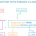
Anatomy of a CSS Rule

One of the basic skills in CSS is knowing the anatomy of a CSS Rule. A CSS Rule is a chunk of code (written in CSS) that styles certain components in HTML, typically its element, class or ID. There are other ways to style HTML components, but they’re a little beyond the scope of this tutorial. The following is a walkthrough of the basic anatomy of a CSS Rule.

cssanatomy1

The above CSS Rule is a very basic block with an HTML Element selector and a declaration block. The Selector highlighted in red is typically the HTML component that you want to target with your CSS to style. In this case, we’re targeting “p”, which is usually considered to be the <p> or paragraph tags in an HTML document. Other types of HTML Elements include <h1> to <h6>, <span>, <ul>, <li>, etc.

The declaration portion of the above diagram represents the Declaration block. Declarations are typically the properties and value pairs that are used to describe specific aspects of the selector that we want to change. In the above example, we’re setting the size of the font to 1.4em (16pt or 22px), and the color to #888888, which is a medium grey color written in HEX.

So those are the two basic components of a CSS Rule, but there’s more to it. Check this out…

cssanatomy2

This is the usual CSS Rule Anatomy diagram you’re going to see. Here we’ve got the Selector and the Declaration as we saw above. Except now we have two other components within the Declaration block. Property in orange represents the type of setting we want to change using our CSS. Types of properties depend upon the type of Selector we’ve targeted as some are compatible with certain properties while others are not. The Selector we’ve used in this instance is a class selector called “.roses”. The dot infront of “roses” is what gives it away as a class, possibly applied to a DIV element like this:

<div class="roses"><p>A Dozen Roses</p></div>

Since we know in our HTML that .roses is a class of a div, we know that we’re dealing with a Block element, and therefore, can use typical Block properties on it such as setting its background color. Some properties work whether you’re dealing with a Block or Inline element.

In blue we have the Value which represents what the property should be set to. For example, background color is being set to #f8f8f8 which is a very light grey. And the font-family property is set to Helvetica, Arial, Sans-Serif fonts. Properties in CSS usually need an accompanying value. Otherwise, the properties won’t know what settings they should apply and will therefore do nothing.

You may have noticed that there are two Curly Braces (I call them fancy brackets personally, but in the interest of not confusing anyone…), they wrap around the Declaration block. This is typically done so CSS understands where to start the declarations for a particular Selector and when it should stop. You will also notice Semicolons after each declaration is completed. This is again done so CSS knows when to stop applying values to a specific property. Finally, you’ll notice the Colon after the property, this is so CSS knows you’re done writing the property and are going to move onto writing in the values for that property.

OK, let’s take a look at one last example…

cssanatomy3

The above example is the same as the previous one except the Selector is now an <a> instead of a class. Our Selector also as a second component to it highlighted in purple. This is a Pseudo-Class. Pseudo-Classes are used to detect the state of a selector. For example, :hover is used to detect when a user hovers their cursor over the selector. There are other types of Pseudo-Classes that are used to wait for user responses too such as :focus which waits for a user to select something. Some Pseudo-Classes aren’t specifically waiting for user input and are instead used to target specific elements within HTML such as :first-child, which locates the first member of a selector type.

So there you have it, a run-through of a CSS Rule’s anatomy, plus some bonus tidbits.

Resources

MDN Pseudo-Classes Documentation


CSS Tutorial: Simplifying :nth-child

I’m going to take a moment to explain a CSS concept that tripped me up when I first heard about it and started using it: nth-child. This is a really basic and quick overview of the nth-child class so it won’t go into any specifics or lots of details about the philosophy behind the pseudo class.

It does assume that you already understand basic CSS terminology (ex. you know what a pseudo class is, you understand how to write CSS). So without further ado.

nth-child sounds like a B-List horror or sci-fi movie, but it is actually a CSS concept that allows us to select multiple elements at once by using numbers and some simple algebraic equations. The :nth-child pseudo class allows you to target specific items, elements and even a chain of elements based on a little bit of math. For now, let’s focus on the simplest nth-child declaration:

ul li:nth-child(4) {
	color: #89f89f;
}

The CSS above uses nth-child to search for the fourth list or LI item and make only that fourth item the color of #89f89f. You can change the number 4 to any other number. For example if you changed the number from 4 to 5, and it will change only the fifth item to become the #89f89f color instead.

Moving on to more complicated nth-child classes we need to do a bit of light math. Most notably; algebra. nth-child pseudo classes allow us to target specific elements inside of another element as we saw above, but it can also allow us to target chains of elements. For example:

ul li:nth-child(3n+1) {  
  color: #89f89f;
}

The above CSS rule will change the color of every third list item to #89f89f. But how is it doing that and what is this crazy algebra formula for?

The formula 3n+1 can also be expressed as (3xn)+1. In this case, you’d have the first selection for every third item. If you’re like me, and think this all sounds way more complicated than it should be and numbers give you nightmares, then don’t worry. Thankfully there’s a trick to figuring out how nth-child works without resorting to too much math.

Here’s the trick: Think of the 3n portion in the above equation as the pattern or how many you want. Think of the +1 portion in the above equation as the first number to start the pattern.

So if we had 3n+1, nth-child will start the pattern at the first item according to the +1 portion, then for every third item according to the 3n portion, it will affect those.

Here’s another example that we can walk through:

ul li:nth-child(4n+2) {  
  color: #6699ff;
}

In the above example, the second list item will have the color of #6699ff according to the +2 portion of the formula. Then every fourth list item will be of the color #6699ff because of the 4n portion of the formula.

Some very awesome people have created a tool called the :nth Tester to illustrate how the formula works. You can access this tool here: :nth Tester

Pseudo classes can throw a few people for a loop, but it is important to understand how they work because they come in handy if you were to dabble in jQuery, work with more complex HTML5 and CSS3 concepts or even while working with other web programming languages.


Coding a Button with CSS Only

When I found out how to create CSS buttons, it was like someone handed me a big, free piece of candy. Finally, no more time spent in Illustrator drawing buttons, variations for buttons and making sure all of them lined up and worked when someone moused over them! So here’s a beginner’s guide to creating some fancy CSS buttons!

First thing’s first, we have to create a link in HTML with a CSS class so we can style our fancy new button. Here’s what my code looks like:

 <a href="http://www.google.com" class="fancy_button">
Go to Google</a>

All right! So we got the first step in making a pretty button. But, if you preview your button right now, it’ll probably look something like this:

Go to Google

Yeaaaah, not the beautiful button we were expecting. That’s where the CSS class that we defined (fancy_button) comes into play. When we declared a class for the HTML link that we made, we’re telling the link to go search in our linked CSS Stylesheet for a class called .fancy_button and pull the styling options for our button from there.

Let’s add some styling to our link to make it more button-like. First I declare the link as a block element. By default, links are inline elements. We are making our fancy_button link a block element instead so we can manipulate different parameters such as background color. So, your CSS should look like this:

.fancy_button {
 display: block;
 }

In the above code, I’m declaring a CSS class named fancy_button so our link will know where its class styles are being referenced. Then I declared a display: block to make the link behave like a block element instead of an inline element. It still won’t look like much if you preview things at this stage. But let’s add a background color and see how that mixes things up:

.fancy_button {
 display: block;
 background: #62869b;
 }

Your button should now look like this:

The button has a background.

The button has a background.

Still doesn’t look like much of a button, right? Part of that is because there are no defined widths or heights for our button. So it assumes an automatic height, and an automatic width. The nature of a block element is to assume that it should take up the entire width of a page unless told otherwise. Let’s tell it otherwise now.

I’m going to give my button a set width so it doesn’t stretch all the way across my page, and I’ll give it a bit more height so there’s some padding between my link name and the edges of the button. Here’s my CSS code now:

.fancy_button {
 display: block;
 background: #62869b;
 width: 200px;
 height: 50px;
 }

And here’s what your button should look like now:

It's slowly coming together.

It’s slowly coming together.

Some problems with our button still, but let’s remedy the most immediate one which is the text of the button sitting in the upper left. We can resolve this issue by using some padding on the text to push it down into the middle and then center aligning it on the button:

.fancy_button {
 display: block;
 background: #62869b;
 width: 200px;
 height: 50px;
 text-align: center;
 padding: 25px 0 0 0;
 }

OK, I added a text-align that centers our text and then some padding to push our link down to the middle. I arrived at the padding amount of 25px at the top by dividing 50 in half. You can do this to other height values too. For example, if you had a button that was 20px high, you’d push your text down by 10px or 20px divided in half. Anyway, here’s what the button looks like now:

Now things are aligned properly.

Now things are aligned properly.

OK, let’s do something about that ugly font and link color. I’m going to go with a web standard to keep things easy, but I’ll definitely do something about that default blue. And while I’m at it, I’m going to get rid of the underline too:

.fancy_button {
 display: block;
 background: #62869b;
 width: 200px;
 height: 50px;
 text-align: center;
 padding: 25px 0 0 0;
 font: 1.2em/12px Verdana, Arial, Helvetica, sans-serif;
 color: #fff;
 text-decoration: none;
 }

I’ve added a font declaration that told my button to display the text as 12px Verdana (and some fallbacks), with a white color and to get rid of that unnecessary underline. Now here’s what things look like:

Text looks a bit better.

Text looks a bit better.

Before we go on to modify what the button will do when someone mouses over it, let’s fancy it up even more with some rounded corners to make it a little more interesting to look at:

.fancy_button {
 display: block;
 background: #62869b;
 width: 200px;
 height: 50px;
 text-align: center;
 padding: 30px 0 0 0;
 font: 1.2em/12px Verdana, Arial, Helvetica, sans-serif;
 color: #fff;
 text-decoration: none;
 -webkit-border-radius: 15px;
 -moz-border-radius: 15px;
 border-radius: 15px;
 }

I added a border-radius of 15px that will affect all four corners to my button, and since border-radius is one of those CSS3 things that are in the works, I’ve included a browser prefix for Webkit and Mozilla-based browsers. Also I’ve noticed the text on our button doesn’t look like it’s sitting quite in the middle. So I increased our padding from the top to 30px. Here’s what our button looks like:

looks more button like, already.

looks more button like, already.

I’m pretty happy with the button right now. So let’s go on and define how the button will react when a user mouses over it. For this, we’re going to need a pseudo class that does something when a user hovers (or mouses) over the button. Here’s my CSS:

.fancy_button {
 display: block;
 background: #62869b;
 width: 200px;
 height: 50px;
 text-align: center;
 padding: 30px 0 0 0;
 font: 1.2em/12px Verdana, Arial, Helvetica, sans-serif;
 color: #fff;
 text-decoration: none;
 -webkit-border-radius: 15px;
 -khtml-border-radius: 15px;
 -moz-border-radius: 15px;
 border-radius: 15px;
 }

 .fancy_button:hover {
 background: #3e5a6b;
 }

I used a pseudo class on my .fancy_button class to tell it to change its background color when someone hovers their mouse over the button. So now when you visit your button, someone hovering over it will change the button’s background color to something darker:

Hovering over the button makes it a darker color.

Hovering over the button makes it a darker color.

That was vastly easier to do than in the old days when you had to work with Javascript, or replace images in your CSS. At this point, you should have a pretty nicely working button. You can take it to the next level too and add shadows, gradients, and even transitions. But maybe that’s a tutorial for another day–or maybe you want to play around with that stuff on your own and see what masterpieces you’ll come up with.

Click here to download the source code for this tutorial.

Good luck on your button creation adventures!


Colors on the Web RGB vs. HEX vs. HSLa

For people just starting out in web design, finding out about all the different languages and their various nuances is difficult enough. Add in the fact that web languages change on a daily basis–even plain old HTML and CSS have hundreds of considerations to take into account, and all this stuff can be pretty overwhelming. One of the sources of confusion that I’m often asked about is the difference between RGB and HEX and why someone would want to use one or the other.

The Definitions

Before we get into when you use one or the other, we have to do some defining and for this, we’ll go back to a topic near and dear to my heart: Color Theory.

RGB or Red/Green/Blue is a color model. Similar to the more familiar RYB (Red/Yellow/Blue) model that most people are more familiar with if they’ve studied the color wheel. RGB is the color model used for websites. We use RGB instead of RYB because it is additive. An additive color model is one that works for illuminated media–which is a fancy way of saying, content that lights itself. Additive can also be thought of as colors that add up to emit light. When you’re using the RYB color model (or even the CMYK model) you should be working with subtractive color. This means that instead of lighting itself up, the content is displayed on a surface where light is bouncing off of it. This is because subtractive colors work by reflecting and absorbing light.

The Difference Between HEX and RGB

Back to the question at hand. This is an example of a HEX color code:

#33743b

This is the same HEX color code in RGB, where red is the first number, green is the second, blue is the third:

51, 116, 59

Having looked at those two, you’re probably wondering why on earth you would ever use RGB, considering the first example is a lot easier to remember and type out. The thing is, both versions have different uses, even if the end result is usually the same.

The one time you may wish to convert from HEX to RGB is when you need to access the opacity or alpha of an element. At which point, you would use RGBA. A typical RGBA value would look like this:

51, 116, 59, 0.65

In the above code, the first three values represent the Red, Green, Blue values and the last value (0.65) represents the alpha. At 0.65 alpha, we are seeing the above colors at 65% opacity.

Then There’s HSLa

HSLa stands for Hue Saturation Lightness alpha. HSLa somewhat resembles RGBA, except the first value stands for our Hue–or color. We declare our colors by looking at the color wheel. The wheel is–obviously–a circle where reds are around the 0 degrees to 360 degrees area, 120 degrees are our greens, and 240 degrees are our blues.

Saturation is expressed as a percentage. When we talk about the saturation of a color, we’re talking about how much grey it has. AT 100% the saturation is all the way up and we are viewing the color fully.

Lightness is also expressed as a percentage and describes how much black or white we have in a color. At 0% we have full black. At 100% we have full white.

Opacity works as a decimal like it does in RGBA, where 1 represents fully opaque, 0 represents fully transparent, and everything in between is partially opaque. For example, 0.45 means that an element is 45% opaque.

A typical HSLa value looks like this:

310, 30%, 20%, 0.65

Writing CSS for HEX, RGBA & HSLa

Here are some examples for how you would write a CSS rule for a paragraph tag using these three values.

First, let’s look at HEX:

p {
color: #25547f;
}

Here’s that same declaration, only in RGBA this time:

p {
color: rgba(37, 84, 127, 1);
}

And here’s the same declaration in HSLa:

p {
color: hsla(209, 55%, 32%, 1);
}

Which one to use?

HEX is very attractive because it’s short and simple to remember and type out. But HEX might not work for you in all situations, which is when you may wish to consider one of the other two methods. Both of which have their pluses and minuses.

RGBA is well-known and supported in older versions of Internet Explorer (9 and older). It has an additional field for alpha values which come in handy when you want to work with opacity.

HSLa is a newer, more intuitive way to work with colors. Unlike RGBA where we have to mesh some numbers around to get the color we want, we can grab the Hue then work with percentages to get the saturation and lightness levels that we need. HSLa also includes an alpha value for opacity.

The one thing to note regarding HSLa is that, like I said above, it isn’t supported by older versions of Internet Explorer. So if you were going to use HSLa, you’ll need to rely on some fallback codes and this could mean bringing in RGBA or HEX. A typical fallback code for an HSLa statement would look like this:

p { 
    color: #25547f;
    color: hsla(209, 55%, 32%, 1);
}

In the above code, the first declaration is a HEX value that’s meant to work as our fallback. The second declaration is for HSLa and will be used for browsers that can support it.

Some stuff to make things easy

Some designers/developers use programs that favor HEX over RGBA, and some even use programs that have built-in tools for HSLa, but what if you find yourself needing to convert one to the other? Here are some online tools to help you convert these values back and forth:

HEX to RGB: Converts HEX values into RGB.

RGB to HEX: Converts RGB to HEX.

HSL Color Picker: Can convert HEX or RGB into HSL.


CSS Tutorial: Simple Text Transitions with CSS3

With CSS3 comes some very fancy effects including text transitions that you can use to create a bit of animation and interest in your websites. Some CSS3 transitions work with pseudo classes to create an effect when a user hovers their mouse over a link or image. I will only be covering transition effects for links or text in this post.

What I mean when I talk about a text transition is something like this:

Hover Over Me!

See how the colors shift and change gradually? Good thing you can easily create a simple text transition like that with almost no code at all. Here’s the most basic text transition you can write in CSS:

a { 
   color: #888777; 
   -webkit-transition: color 1s ease-in;
   -moz-transition: color 1s ease-in;
   -o-transition: color 1s ease-in;
   -ms-transition: color 1s ease-in;
   transition: color 1s ease-in;
} 
a:hover {
   color: #668899;
}

The above chunk of shorthand code has a couple of things going on. First are the two link rules, one sets the styling for the general link, the other one sets the styling for the link when someone hovers over it. You’ll notice, rather obviously, that we’re applying the transition effect on the general link rule.

The Anatomy

When we declare a transition, we have to target the specific browsers that contain the functionality for it. In the above code, I’ve targeted three major browsers and I have a general “transition” declaration at the end. In this case, “-webkit-transition” refers to Webkit based browsers (Chrome, Safari). “-moz-transition” refers to Mozilla browsers (Firefox), -ms- is Internet Explorer, and “-o-transition” refers to Opera.

The four values in a transition declaration are the value to be transitioned, duration of the transition, type of transition, and transition delay.

For the value, we are declaring that the color should be affected here. For the duration, we are saying it should only last about a second. You can draw this number out longer, but a 5s transition for a hover over link can get pretty silly. Finally, we declare the type of transition, which in this case, is ease-in.

Breaking it Down

Let’s break down the above shorthand CSS declaration and view transition in its basic components. If we were to dissect the above chunk of code into its base elements, it would look like this:

a { 
   color: #888777;
   -webkit-transition-property: color;
   -webkit-transition-duration: 1s;
   -webkit-transition-timing-function: ease-in;
   -webkit-transition-delay: 0;

   -moz-transition-property: color;
   -moz-transition-duration: 1s;
   -moz-transition-timing-function: ease-in;
   -moz-transition-delay: 0;

   -ms-transition-property: color;
   -ms-transition-duration: 1s;
   -ms-transition-timing-function: ease-in;
   -ms-transition-delay: 0;

   -o-transition-property: color;
   -o-transition-duration: 1s;
   -o-transition-timing-function: ease-in;
   -o-transition-delay: 0;

   transition-property: color;
   transition-duration: 1s;
   transition-timing-function: ease-in;
   transition-delay: 0;
}

You can see how all the different declarations of transition work together now that they’re broken up from the shorthand declaration. However, I don’t really want to spend all day writing out my transitions in long chunks like that, so the short hand version is more efficient and works the same way.

Delays

Notice the addition of a “transition-delay” declaration that is set to 0 in the broken down declarations. You can use transition delay to tell an element to wait before beginning a transition. This allows you to stagger your effects for an interesting visual. To declare a delay in a shorthand declaration, simply add the delay value after the duration value. Like this:

a { 
   color: #888777; 
   -webkit-transition: color 1s 2s ease-in;
   -moz-transition: color 1s 2s ease-in;
   -ms-transition: color 1s 2s ease-in;
   -o-transition: color 1s 2s ease-in;
   transition: color 1s 2s ease-in;
}

The above chunk of code tells my link to wait two seconds before it starts to run the ease-in transition for my link. Not very practical for a link, but if you were working with multiple images or pop-ups, this could come in handy!

Types of Timing Transitions

Ease-in is only one of the timing transitions available. There’s a bunch more with W3 Documentation. Understanding and reading all that could take a full day. Here’s a quick run-down:

Ease: Begins an effect faster than it ends the effect (slower).
Ease-In-Out: Begins an effect slower than it ends the effect (faster).
Ease-In: Starts an effect slowly.
Ease-Out: Finishes an effect slowly.
Linear: Executes an effect at one speed.

Any one of these timing transitions can be substituted in for the above effect like this:

a { 
   color: #888777; 
   -webkit-transition: color 1s ease-in-out;
   -moz-transition: color 1s ease-in-out;
   -ms-transition: color 1s ease-in-out;
   -o-transition: color 1s ease-in-out;
   transition: color 1s ease-in-out;
} 
a:hover {
   color: #668899;
}

The above code will modify my link so that an ease-in-out timing transition will be applied to it instead of ease-in.

To add a level of complexity to your transitions, you can use the power of cubic beziers. Most of the time, if you’re just developing websites, you probably won’t need to mess with cubic beziers much. But, if you do and because I am barely competent with math (d’aww), I will let someone who is much better with numbers do the hard work to explain those. Check out The Art of Web for their excellent cubic bezier documentation.

There is also a super cool website where you can check out the various types of transitions and cubic beziers here: Cubic-Bezier

Transitions also work with images and can create some really cool effects. In fact, you can make entire slideshows with CSS transitions and images. But we’ll be covering that in another tutorial that’s coming soon!


CSS Tutorial: Using Text Shadows

I’m seeing more and more designs utilizing text shadows to increase legibility or create beautiful typographic effects. While I was planning my redesign, I wanted to incorporate the text-shadow effect to maximize the flat illustrative look that I was going for. Text shadows are a cool CSS trick that can apply a blurry or solid shadow behind your text. Here’s how to use them!

Probably the simplest text shadow you can make is the standard, solid shadow:

text-shadow: 2px 1px 0px #777;

In the code above, I’m using the CSS declaration “text-shadow”, which creates a shadow like this:

text-shadow01

The basic text-shadow declaration goes like this:

text-shadow: horizontal vertical blur #color;

So, if you were looking for a text shadow to cast from the lower right instead of the upper left, you would manipulate the horizontal and vertical positions in your declaration. So with that having been said, your declaration would look like this:

text-shadow: -2px -1px 0px #777;

And the text shadow would look like this:

text-shadow02

You can change the color of the text shadow, by altering the hex code at the end of the declaration (text-shadow also works with RGBA codes). Note: If you want to change the color of the text itself instead of its shadow, you just use a normal color declaration. Let’s say I want my text to be blue with a dark blue shadow this time. My declaration would look like this:

color: #669ae1;
 text-shadow: -2px -1px 0px #2f568c;
 

And my text would end up looking like this:

text-shadow03

Okay, so how does blur work for text shadow? Basically, you add blur by increasing the blur value from 0 to as high as you want. For example, if I wanted a bit of blur in my text shadow,  would alter the declaration like this:

color: #669ae1;
 text-shadow: -2px -1px 5px #2f568c;

The one thing to note is the third value behind the horizontal position value and the vertical position value. I raised that value from 0px to 5px and get a blurry shadow behind my text, like this:

text-shadow04

If that shadow is just too dark or too overwhelming, you can also reduce the shadow’s opacity through CSS. To manipulate the opacity, we’ll have to use the RGBA color value for our shadow instead of the HEX code so that we get some control over the opacity.

So, for example, if we took the code above and swapped out our HEX code for an RGBA value, we’d get this:

color: #669ae1;
 text-shadow: 2px 1px 5px rgba(47, 86, 140);

Now if we want to change the opacity, it is just a matter of adding one addition value to the end of the RGBA code. Opacity is measured from 0 – 1, where 0 is completely transparent and 1 is completely opaque. You use decimals within the 0 – 1 range to determine how opaque you’d like your shadow to be. I want mine to only be 50% opaque. So I would declare the opacity value as 0.5 like this:

color: #669ae1;
 text-shadow: 2px 1px 5px rgba(47, 86, 140, 0.5);

Note that the opacity value is declared inside of the rgba value and not outside. So the above code will generate my text shadow to make it look like this:

text-shadow05

Well, that seems less overwhelming at least. Text shadow, as you can see, is pretty simple to remember and use. But if you just need something quick to help you get up and running there is a generator for this that you can access here: CSS3Gen’s Text-Shadow Generator.