CSS Shapes is a relatively new technology being developed by the team at Adobe Platform that not a whole lot of websites use yet, but will undoubtedly become very popular when more browsers support it with consistency. It involves Wrapping text with CSS Shapes. This allow you to flow text and other forms of content along the edges of things like curves, circles, ellipses. This allows designers to break away from the constraint of the rectangle. Flowing content along a curve or shape has been possible in print layouts for a very long time, but up until now was a pain to get working when it came to interactive design.
Browser Support
At the moment, CSS Shapes are limited to browsers at or later than Chrome 37, Safari 7.1, Android Browser 40, iOS Safari Browser 8 and Opera Mobile 24. Adobe has created a Shapes demo on Codepen, so if you were wondering if your browser supports Shapes, you can test it out quickly by going here: codepen.io/adobe/full/Brtdz
If your browser has CSS Shapes support, you should see something like this:

See how the text flows along the edge of the pottery piece? Pretty neat. I’m looking forward to being able to use Shapes once support becomes more widespread. For now, we’ll go over how to implement CSS Shapes so once all the browsers catch up, you can jump right in. By the way, you can check out up-to-date browser support information for CSS Shapes at: caniuse.com
Demo Files
You are going to need some demo files for this. You can always create your own, but I’ve gone ahead and made some to save you some time. You can grab those demo files by clicking here: Download Demo Files
A completed set of demo files will be provided at the end of this tutorial.
The CSS Shapes Property & Functions
The CSS Shapes property is shape-outside. Where the property will expect functions, typically in the form of shapes such as circles, ellipses or polygons. A typical CSS Shapes property declaration looks like this:
.my-circle {
 shape-outside: circle(50%);
 background-color: #3ea7c2;
 width: 400px;
 height: 400px;
 float: left;
 }
In the above code, you have a class element selector identified as .my-circle. You’re also going to be floating your shape to the left of the container or screen and your element has a width and height of 400px. Ordinarily, without shapes, what you would get is a box that is 400px in height and width, floating to the left and has a blue color. Those things you should already be familiar with. The CSS Shapes property comes into play with the shape-outside declaration. Let’s break it down:
shape-outside calls the CSS property that will define the shape you wish to use in order to flow content outside of the shape.
The shape-outside property will expect the following functions:
circle()
ellipse()
inset()
polygon()
circle() expects the parameters of radius, circle-x, and circle-y. Radius determines how big your circle is, in the code snippet above, we identified the Radius as 50%. In this context, it defines 50% of the width of 400px and the height of 400px. Circle-X and Circle-Y determine the center point of the circle. You can move the center point around to allow for some overlapping effects.
ellipse() expects the parameters of radius-x, radius-y, circle-x, circle-y. Because ellipses are not perfectly round, you need two radii to be defined. One for its x-axis and the other for its y-axis. The other two parameters of circle-x and circle-y are the same as they were for the circle() function, in that they define the center point for the ellipse.
inset() expects a top, right, bottom and left value with a border-radius. Inset is a little confusing at the moment because its functions are already covered by traditional uses of floats, padding and margin. It allows you create rectangle shapes that you will use to wrap content around. I won’t be covering inset much in this tutorial because (at the time of this writing) you are still better off using more traditional and familiar methods to deal with all the features that inset() allows.
polygon() expects parameters of x1, y1, x2, y2, x3, y3, … Because polygons deal with more unusual shapes than circles, ellipses and rectangles, they can accept as many x,y coordinates as you need to define the shape. So you could have a super complicated shape in the form of a tree and still be able to define the essential shape to wrap your text. Typically when defining a polygon, you need a minimum of three points or vertices to define a triangle. There is no maximum, but keeping polygons simple when all you need to do is wrap text will save you from headaches in the long run.
Using CSS Shapes Demo – Circle()
I’ve set up some files we can use for this demo and you can grab them by clicking here. Nothing very complicated, just some images, html files and css files inside of different folders. One folder for each of the four demos we’ll be doing in this tutorial. If you’d rather not use my demo files, here’s the HTML to start off for the circle demo (you will need to do the file setup yourself:
<img class="my-circle" src="circle.png">
 <p>Lorem ipsum dolor sit amet, consectetur adipiscing elit, sed do eiusmod tempor incididunt ut labore et dolore magna aliqua. Ut enim ad minim veniam, quis nostrud exercitation ullamco laboris nisi ut aliquip ex ea commodo consequat. Duis aute irure dolor in reprehenderit in voluptate velit esse cillum dolore eu fugiat nulla pariatur. Excepteur sint occaecat cupidatat non proident, sunt in culpa qui officia deserunt mollit anim id est laborum.</p>
We’re going to create a circle shape first to flow some text around it. Open up the circle-shape folder and open the HTML and CSS files in your favorite editor. This is probably the easiest shape to do because it takes in the fewest parameters. So, taking a look at our HTML, we have this defined for our circle demo in HTML.
Note that the image has a class of my-circle which we will be using to define the shape later on. The above HTML shouldn’t be new to most of you, I’m just throwing an image on the screen with a paragraph of dummy text. Let’s take a look at the CSS. You should have this:
.my-circle {
float: left;
}
I have defined a class of my-circle and set it to float to the left. Now, let’s add in our shape declarations. I’m going to start by defining the height and width I want my shape to be. Because my image is 400px by 400px, that’s what I’ll also set my height and width to. If you had a circle image of 235px width by 235px height, you would then probably want to define 235px for width and 235px for height for instance. So now you should have this:
.my-circle {
float: left;
width: 400px;
height: 400px;
}
We don’t have much of a shape yet, so let’s define our shape-outside property so that text will start wrapping:
.my-circle {
shape-outside: circle(50%);
width: 400px;
height: 400px;
float: left;
}
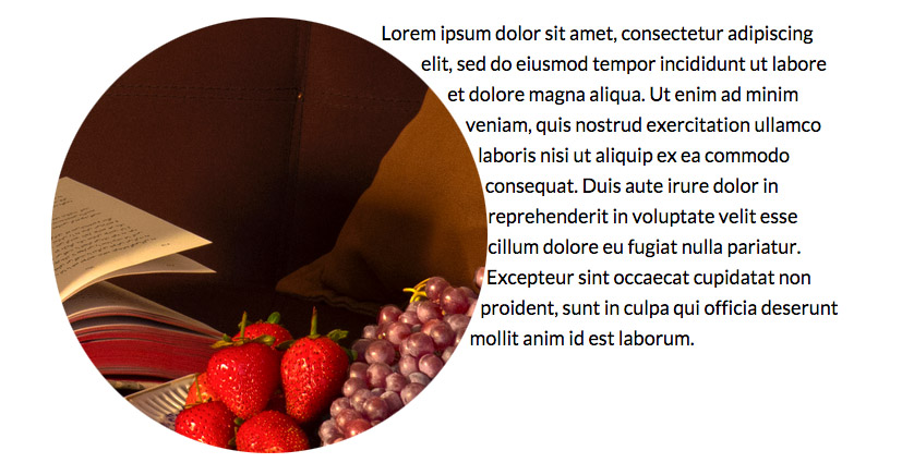
In the above shape-outside declaration, I defined the property shape-outside because I want to wrap the text outside of the shape instead of inside. I’ve defined the shape as a circle so I use the circle() function and set its radius to 50%, which means it starts in the center and will use that point to draw a circle that will have a total width of 400px by 400px. Why use 50% instead of 100%? Because at 100%, you will start in the center of a circle and it will draw out on all sides by 400px and you will end up with a 800px by 800px circle. Instead, we use 50% so the center point will only draw out by 200px and you will then end up with 400px by 400px worth of circle. Remember, the radius starts in the center of the circle. I know how elementary that is, but it’s super easy to forget stuff when we’re focused on learning something new.
So, if everything went off without a hitch, you should see something similar to this:
If you don’t see what I have above, check your syntax and make sure you’re using a browser that supports CSS Shapes. Not all browsers do yet as of this writing so if the shapes aren’t working, think about looking at your demo file in another browser such as Chrome or a recent version of Safari.
Great! We got CSS Shapes working for a circle! Let’s move onto the Ellipse now.
Using CSS Shapes Demo – Ellipse()
Working with the Ellipse() function over the Circle() function isn’t much different, you’re still essentially dealing with a pretty simple shape, only this time, it might take an additional parameter. Open up the ellipse-shape folder you downloaded earlier. Here’s what I have for my HTML for the ellipse demo:
<img class="my-ellipse" src="ellipse.png">
<p>Lorem ipsum dolor sit amet, consectetur adipiscing elit, sed do eiusmod tempor incididunt ut labore et dolore magna aliqua. Ut enim ad minim veniam, quis nostrud exercitation ullamco laboris nisi ut aliquip ex ea commodo consequat. Duis aute irure dolor in reprehenderit in voluptate velit esse cillum dolore eu fugiat nulla pariatur. Excepteur sint occaecat cupidatat non proident, sunt in culpa qui officia deserunt mollit anim id est laborum.</p>
<p>Sed ut perspiciatis unde omnis iste natus error sit voluptatem accusantium doloremque laudantium, totam rem aperiam, eaque ipsa quae ab illo inventore veritatis et quasi architecto beatae vitae dicta sunt explicabo. Nemo enim ipsam voluptatem quia voluptas sit aspernatur aut odit aut fugit, sed quia consequuntur magni dolores eos qui ratione voluptatem sequi nesciunt. Neque porro quisquam est, qui dolorem ipsum quia dolor sit amet, consectetur, adipisci velit, sed quia non numquam eius modi tempora incidunt ut labore et dolore magnam aliquam quaerat voluptatem. Ut enim ad minima veniam, quis nostrum exercitationem ullam corporis suscipit laboriosam, nisi ut aliquid ex ea commodi consequatur? Quis autem vel eum iure reprehenderit qui in ea voluptate velit esse quam nihil molestiae consequatur, vel illum qui dolorem eum fugiat quo voluptas nulla pariatur?</p>
The only major point of interest up there is the changing of the image file name, the class to my-ellipse and the additional paragraph of dummy text. Otherwise, it should all be the same. Let’s go into our CSS where I have this:
.my-ellipse {
width: 335px;
height: 494px;
float: left;
}
So I’ve gone ahead and defined the width and height of my ellipse. Note that it’s two rather awkward numbers, but that’s OK. You don’t need perfectly round numbers for shapes to work and many times you won’t be dealing with perfect numbers, though doing so would make things a little easier. Now, even though we have an ellipse instead of a circle, this would still yield acceptable results:
.my-ellipse {
shape-outside: ellipse(50%);
width: 335px;
height: 494px;
float: left;
}
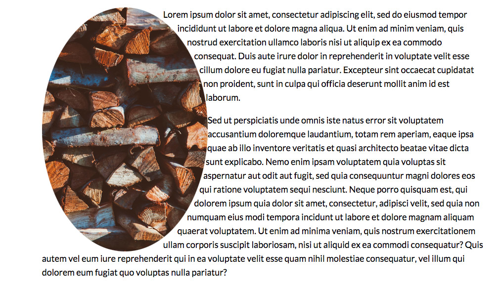
You define shape-outside so the text wraps on the outside of the ellipse and then we declare 50% and let the browser figure out the math by allowing it to divide the width and height by half and draw the ellipse based upon the values we set for those two properties. You will get the text to wrap around the ellipse just fine. But let’s say you want to do things the manual way and clearly define the Circle-X and Circle-Y parameters of the ellipse() function. What we would do is manually divide the width and height ourselves and plug them in like this:
.my-ellipse {
shape-outside: ellipse(167.5px 247px);
width: 335px;
height: 494px;
float: left;
}
This will allow you to define an ellipse around the image without using a straight percentage should you ever have the need to. If everything went well, you’ll get this:
Using CSS Shapes Demo – Polygon()
Polygons are exciting because you’re not just limited to using circles or ellipses, now you can theoretically wrap things around any crazy shape you want. Let’s open up the polygon-shape folder. CSS Shapes open up opportunities for designers to do things that up until now, they’ve only been able to accomplish within the realm of print design–or with a massive amount of time and frustration in code. Anyway, my HTML for the polygon() demo:
<img class="my-polygon" src="polygon.png">
<p>Lorem ipsum dolor sit amet, consectetur adipiscing elit, sed do eiusmod tempor incididunt ut labore et dolore magna aliqua. Ut enim ad minim veniam, quis nostrud exercitation ullamco laboris nisi ut aliquip ex ea commodo consequat. Duis aute irure dolor in reprehenderit in voluptate velit esse cillum dolore eu fugiat nulla pariatur. Excepteur sint occaecat cupidatat non proident, sunt in culpa qui officia deserunt mollit anim id est laborum.</p>
</section>
Straightforward enough by now. Here’s my CSS:
.my-polygon {
width: 382px;
height: 300px;
float: left;
}
OK, let’s apply a CSS Shape to this polygon. Now the image itself isn’t a simple shape like a circle, ellipse or rectangle. It’s got an irregular shape that we want to wrap text around. This means we’re going to have to figure out the points in our coordinate system that we’ll need to declare in order to make the browser understand the shape its working with here.
Polygon() should be used when you don’t have a simple shape to work with and depending upon how detailed you want to get, you may be defining a lot of points. Thankfully, our shape is relatively simple, if we were to boil it down, we could probably define three vertices and be done with it. So before we can write our CSS Shape property, we should determine where our points are. Let’s say you were using the example image provided in the demo files:

We can see that the shape is irregular above so using polygon() is the right way to go. So when we go about determining the points of the above image, we’d look in the three major vertices. There is one at the very top, one in the middle and one at the bottom and they are all on the right side. Like this:

Keep in mind that you can’t get away with defining just three vertices otherwise you have a perfect triangle. What we need to do is define the entire shape. So we need the two points on the left side as well:

Now, finding out the points is actually pretty easy. Remembering what order they go in is the harder part. There a multitude of ways to find out the coordinate points of your image. For simplicity’s sake, you can just open up the image in an image editor like Photoshop and locate the points in there using the Info panel. There may be other ways to locate points that are easier and more efficient, but let’s just keep things simple for now.
So when all is said and done, I have the following point values for my sample image, point of origin is in the upper left corner:
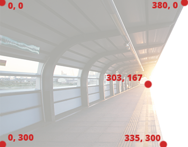
Now that we have the coordinates for our image, we’ll extrapolate them into a parameter. Polygon parameters list X and Y pairs without a comma in between the two partners of the pair. But when you want to list a new pair, you will need to separate the pairs with a comma. It’s easier to show this than explain it in writing so your polygon() parameters should look like this:
0px 0px, 380px 0px, 303px 167px, 335px 300px, 0px 300px
See how each pair is listed next to each other with just a space to separate them? Then between each pair, there is a comma to denote a new pair is being declared. The above parameters are pulled directly from the image. We start putting in the points starting in the upper left corner and move around the shape in a clockwise fashion. So we start in the upper left, go to the upper right, then the point in the middle on the right, then the point in the lower right, then finally the point in the lower left. In our CSS Shapes code, the final declaration for polygon() should look like this:
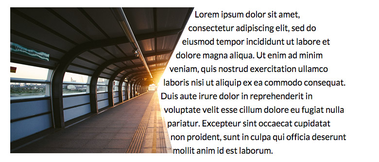
.my-polygon {
shape-outside: polygon(0px 0px, 380px 0px, 303px 167px, 335px 300px, 0px 300px);
width: 382px;
height: 300px;
float: left;
}
If all goes well, you should have something that looks like this:
Wrapping It Up
So that was fun and pretty cool. The major thing to keep in mind is that CSS Shapes are still in development and aren’t supported by all major browsers yet. So while this will become something totally awesome and useful in the future, you should avoid using it in production code. There’s no harm in fiddling around with it though and still using it in your projects provided you have a fallback so users who don’t have browser support for shapes don’t end up staring at a mad ugly website.
If you’re looking for the completed demo files, you can find them by click here: Download Completed Demo Files
Resources
Now, if you just want to draw a custom shape and don’t necessarily have an image in mind, check out some of these neat tools for creating CSS Shapes:
Coveloping CSS Shapes Generator
CSS3 Shapes – CSS Portal
And some more CSS Shapes resources: