Typography is the love of most graphic and web designers. But for some, it can be an intimidating task. Pairing together the right typefaces to create a cohesive design comes from years of experience studying type and understanding how one typeface interacts with another can depend on a huge amount of factors. Here are some tips for combining and using different typefaces on the web to help get the edge off of typography.
There are many different methods that designers use to determine typeface combinations. I will go over some of them in this post and hopefully give you some ideas on how you can pair off type for your next project.
Method 1: Type Systems and Super Families
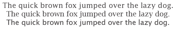
Type Super Families are typefaces that have a large variety of variations. Within a super family, one typeface could have different variations for body text, headers, subheaders, italics, there may even be a serif and sans-serif version of the type. One example of a type super family is Lucida:
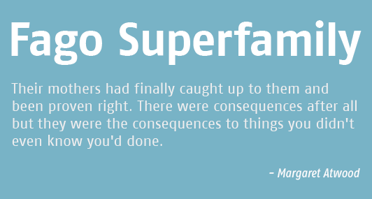
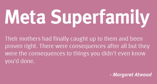
Super families generally contain typefaces with relatively the same structures and proportions, thus ensuring the types in a super family are harmonious but at the same time have elements that allow them to stand out from one another. Some examples of super families in use:
Method 2: Compare and Contrast
Contrast in choosing typefaces can mean a number of things. What it achieves is essentially an accentuation of the type that you use. You can mix and match things in different ways to achieve contrast. For instance, you might want to pair a sans-serif typeface with a serif. Or round typeface with an angular one. Maybe you could also mix a fun type with a neutral one.
When relying on contrast for your type choices, try to focus on weight, scale, proportion, and texture. Remember that you are not looking to draw attention to the type by highlighting their differing personalities. Things need to be done in moderation when choosing type too. Try looking for elements that help discern hierarchy while also harmonizing the text.
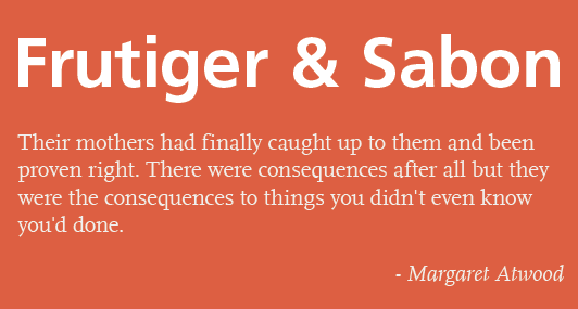
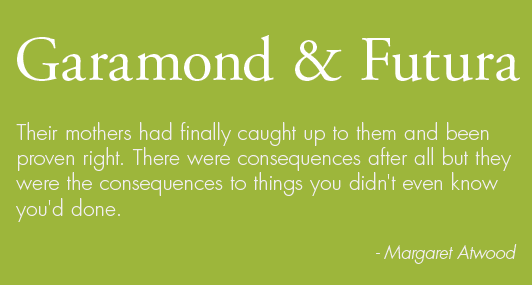
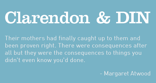
Some examples, using contrast by paring a sans-serif with a serif:
And an example of a distinct type paired together with a neutral one:
With a little bit of time and thought, pairing typefaces together won’t seem as intimidating anymore. If you’re interested in other ways to pair together typefaces, check out these helpful articles:
Best Practices of Combining Typefaces
Four Ways to Mix Fonts